Yep, I'm POSTing. *rimshot* I've been persuaded to open one of these blog things, and those of you who know me might be surprised that I've chosen this particular service by this particular provider. But it seems to be the only one that's both free and (almost) completely customizable, and rolling my own wouldn't be very cost-effective, so there.
↧
Power-On Self-Test...
↧
Using Photoshop as a CGA Bitmap Paint Program
Adobe Photoshop has an "indexed color" editing mode for palettized images, but let's admit it, it sucks. No layers, no anti-aliasing, no filters, no (easy) dithering, and so on so forth: clearly, it's no substitute for DeluxePaint II, Autodesk Animator, or even PC-Paint. There are modern, free and open source packages which explicitly seek to fill this gap, but just for fun, can Photoshop's limitations be subverted?
Recently, at least by my glacial standards of time, someone (thanks, Andrew!) suggested to me the idea of making a timelapse recording of my pixel-pushing process. I hadn't done anything like that before, but I did have a fun concept for a blog title along with a matching image, so I decided to give it a go.
The result is obviously plastered all over this blog's header, but here's the video:
The idea was to restrict everything to four CGA colors (the high-intensity "alternate" palette of cyan-red-white) while still working in layered RGB, so I could still have all the amenities at my disposal, unlike the crippled afterthought that is PS's indexed color mode. I also wanted to simulate intermediate levels by using three 50% dither patterns (black/red, red/cyan, cyan/white) just as if they were solid colors.
After a couple of failed experiments, I stumbled across a convoluted little method that somehow seemed to work: do the actual drawing in greyscale, but slap a series of 7 adjustment layers on top of the whole thing. Each is triggered by a certain range of grey levels and displays a corresponding CGA color (or dither pattern).
Here's the actual stack of layers; Color Fills for the 4 solid colors, and Pattern Fills for the dither patterns (from Layer -> New Fill Layer, select solid color or pattern respectively). For each layer, the input range of greys is specified in Layer -> Layer style -> Blending options. For instance, the pattern layer for alternating black/red pixels is set to blend only when the underlying layer's grey level is between 65 and 67:
![]()
The rest of the layers are set up similarly (as you can probably tell by their names), covering the entire 0-255 range. I gave the "dither" layers much narrower ranges than those of the solid colors - this is just to have finer control over things, otherwise different color pixels can crop up uninvited with things like smooth-edged brushes. Then I set up a handy "palette" image, so I could quickly color-pick while drawing by holding down Alt and clicking a shade of grey:
![]()
So all the actual drawing is done in grey, beneath the fill layers, but as you're drawing, What You See Is What You Get - the state of the art on early '80s IBM PCs and compatibles, 2-bit color pixels in all their glory.
The final drawing...
![]()
...actually looks like this "under the hood":
![]()
This little trick allowed me to combine several techniques here - pixel-precise mouse work for most of the details and shading, anti-aliased curves for drawing outlines with the Pen tool, importing a scanned pen-on-paper drawing (for the "MPH" part), and using a Wacom pen tablet (for most of the background work). I daresay it turned out nice... perhaps not quite on Asphyx-levels of awesome, but I have no presumptions.
Because of the extremely limited palette, it pays off to treat the colors as nothing more than their brightness levels: the result can often look good even when you switch to an entirely different set of colors, as long as they have a similar relationship in terms of luminosity. Of course, this isn't limited to CGA artwork only - the Amstrad CPC has a very similar 4-color video mode, for instance.
This particular method wouldn't work too well with larger palettes however, since the tower of adjustment layers would quickly grow to unwieldy proportions. A program that's actually tailored for this kind of pixel-pushing, such as Grafx2, would obviously be a much better choice (would be nice to get off my ass one of these days and actually learn how to use it).
Recently, at least by my glacial standards of time, someone (thanks, Andrew!) suggested to me the idea of making a timelapse recording of my pixel-pushing process. I hadn't done anything like that before, but I did have a fun concept for a blog title along with a matching image, so I decided to give it a go.
The result is obviously plastered all over this blog's header, but here's the video:
The idea was to restrict everything to four CGA colors (the high-intensity "alternate" palette of cyan-red-white) while still working in layered RGB, so I could still have all the amenities at my disposal, unlike the crippled afterthought that is PS's indexed color mode. I also wanted to simulate intermediate levels by using three 50% dither patterns (black/red, red/cyan, cyan/white) just as if they were solid colors.
After a couple of failed experiments, I stumbled across a convoluted little method that somehow seemed to work: do the actual drawing in greyscale, but slap a series of 7 adjustment layers on top of the whole thing. Each is triggered by a certain range of grey levels and displays a corresponding CGA color (or dither pattern).
Here's the actual stack of layers; Color Fills for the 4 solid colors, and Pattern Fills for the dither patterns (from Layer -> New Fill Layer, select solid color or pattern respectively). For each layer, the input range of greys is specified in Layer -> Layer style -> Blending options. For instance, the pattern layer for alternating black/red pixels is set to blend only when the underlying layer's grey level is between 65 and 67:

The rest of the layers are set up similarly (as you can probably tell by their names), covering the entire 0-255 range. I gave the "dither" layers much narrower ranges than those of the solid colors - this is just to have finer control over things, otherwise different color pixels can crop up uninvited with things like smooth-edged brushes. Then I set up a handy "palette" image, so I could quickly color-pick while drawing by holding down Alt and clicking a shade of grey:

So all the actual drawing is done in grey, beneath the fill layers, but as you're drawing, What You See Is What You Get - the state of the art on early '80s IBM PCs and compatibles, 2-bit color pixels in all their glory.
The final drawing...

...actually looks like this "under the hood":

This little trick allowed me to combine several techniques here - pixel-precise mouse work for most of the details and shading, anti-aliased curves for drawing outlines with the Pen tool, importing a scanned pen-on-paper drawing (for the "MPH" part), and using a Wacom pen tablet (for most of the background work). I daresay it turned out nice... perhaps not quite on Asphyx-levels of awesome, but I have no presumptions.
Because of the extremely limited palette, it pays off to treat the colors as nothing more than their brightness levels: the result can often look good even when you switch to an entirely different set of colors, as long as they have a similar relationship in terms of luminosity. Of course, this isn't limited to CGA artwork only - the Amstrad CPC has a very similar 4-color video mode, for instance.
This particular method wouldn't work too well with larger palettes however, since the tower of adjustment layers would quickly grow to unwieldy proportions. A program that's actually tailored for this kind of pixel-pushing, such as Grafx2, would obviously be a much better choice (would be nice to get off my ass one of these days and actually learn how to use it).
↧
↧
The Mazes of Shamus - IBM PC Version
I recently revisited an old post on Vintage Computing & Gaming about the Atari 800 version of Shamus, which pretty much maps out the entire game for you. It turns out that the IBM PC version has quite a few differences when it comes to the level maps, so for those of you who actually got to know the game through the PC port (like myself), this post might prove vaguely interesting. Possibly.
The game is a neat little maze shooter by Synapse - think Berzerk, but with a large predefined game world, which adds a sense of exploration to the twitch reflex madness. IBM picked it up for its PC Entertainment Family series, and it wound up on our turbo XT clone, one of the first games I ever played on it. For a first-generation PC title, it wasn't bad; there was just one tiny little snag: the keyboard controls were offensively and game-breakingly horrible.
See, you move your character using the arrow keys, pressing them to walk and releasing them to stop. So far so good, except that the latter part doesn't work very well: the game randomly fails to register the fact that you've just released a key, leaving your character waltzing happily towards the nearest wall. And since the walls in this game kill you on touch, that's kind of like a guy with a weak bladder and poor aim playing russian roulette with an electric fence.
Solution: use a joystick - miraculously, controlling Shamus turns into a silky smooth experience, and not at all like driving a pre-recall 2010 Toyota Lexus with a sticky gas pedal! We did have a joystick to go with that machine, but to me it was an unwieldy monstrosity, probably meant for flight sims and such, and (fortunately for my carpal tunnel) I never took a liking to it. To this day I'm mostly a keyboard guy, but now we have DOSBox, which lets you map joystick events to keys; so I can tell the game I'm using a joystick, and proceed to enjoy my new, non-brain damaged input routines - even though I'm really using the keyboard.
Now that we've found a way to play this game without excessive input device mutilation, let us move on to the maps.
As mentioned above, the level layout in the IBM port turned out to be rather different from the Atari version, at least in levels 2 and 3. I've retained the Atari map's color terminology for keys and keyholes, even though they're all plain green on the PC, courtesy of CGA limitations: you can tell them apart by the number and location of prongs, but that doesn't make a very concise textual legend.
Wherever several room numbers share the same color, the corresponding key will be found in one of them at random -- the others will contain an extra life or "mystery" powerup instead.
![]()
Spoiler warning: maps for all 4 levels of Shamus, IBM PC version. (Click to enlarge)
So there you have it. I've only ever beaten it on Novice, never on Advanced, but if you feel like undertaking such a monumental task^H^H^H^Hwaste of time, now's your chance.
Novice playthrough (sped up 3x):
As you can see, the endgame text is somewhat less disappointing than that of the Atari version - they've actually bothered to instill some sense of accomplishment there, and if you squint real hard, it's sort of rewarding. Wonder what it says if you beat it in Advanced?
The game is a neat little maze shooter by Synapse - think Berzerk, but with a large predefined game world, which adds a sense of exploration to the twitch reflex madness. IBM picked it up for its PC Entertainment Family series, and it wound up on our turbo XT clone, one of the first games I ever played on it. For a first-generation PC title, it wasn't bad; there was just one tiny little snag: the keyboard controls were offensively and game-breakingly horrible.
See, you move your character using the arrow keys, pressing them to walk and releasing them to stop. So far so good, except that the latter part doesn't work very well: the game randomly fails to register the fact that you've just released a key, leaving your character waltzing happily towards the nearest wall. And since the walls in this game kill you on touch, that's kind of like a guy with a weak bladder and poor aim playing russian roulette with an electric fence.
 |  |
Solution: use a joystick - miraculously, controlling Shamus turns into a silky smooth experience, and not at all like driving a pre-recall 2010 Toyota Lexus with a sticky gas pedal! We did have a joystick to go with that machine, but to me it was an unwieldy monstrosity, probably meant for flight sims and such, and (fortunately for my carpal tunnel) I never took a liking to it. To this day I'm mostly a keyboard guy, but now we have DOSBox, which lets you map joystick events to keys; so I can tell the game I'm using a joystick, and proceed to enjoy my new, non-brain damaged input routines - even though I'm really using the keyboard.
Now that we've found a way to play this game without excessive input device mutilation, let us move on to the maps.
Warning: spoilers ahead!
As mentioned above, the level layout in the IBM port turned out to be rather different from the Atari version, at least in levels 2 and 3. I've retained the Atari map's color terminology for keys and keyholes, even though they're all plain green on the PC, courtesy of CGA limitations: you can tell them apart by the number and location of prongs, but that doesn't make a very concise textual legend.
Wherever several room numbers share the same color, the corresponding key will be found in one of them at random -- the others will contain an extra life or "mystery" powerup instead.

Spoiler warning: maps for all 4 levels of Shamus, IBM PC version. (Click to enlarge)
So there you have it. I've only ever beaten it on Novice, never on Advanced, but if you feel like undertaking such a monumental task^H^H^H^Hwaste of time, now's your chance.
Novice playthrough (sped up 3x):
As you can see, the endgame text is somewhat less disappointing than that of the Atari version - they've actually bothered to instill some sense of accomplishment there, and if you squint real hard, it's sort of rewarding. Wonder what it says if you beat it in Advanced?
↧
Shamus Keyboard Woes Explained
My previous post contains copious amounts of whinging about the keyboard controls in this game, but as it turns out, the issue isn't with the game as such - it's about the environment. Recently it was pointed out to me that Shamus uses a buffered input routine (it isn't the BIOS INT 9 handler, but a custom handler that similarly buffers keystrokes), and as such, it's sensitive to the typematic rate and delay set for the keyboard.
For the unfamiliar, these parameters control how long a key must be held down before a repeated keypress is signaled, and then the rate at which the keypress is repeated. Older PC/XT-class machines (which is what this game was targeted at) always booted up with a default delay of 500ms and repeat rate of 10 characters per second; this is what the game assumes, and under these conditions keyboard control isn't a problem.
Trouble starts when these values are altered: newer BIOSes (circa 1986 and onwards) allow changing the typematic parameters by calling INT 16h function 3, and some offer the ability to modify the default values in the CMOS settings; DOS 4+ offers a convenient way of doing that via the MODE command. Specifying lower values results in keyboard events coming in at a faster rate than this particular game can handle them - including key releases, hence the little guy's unfortunate penchant for suicidal runs into the walls.
DOSBox, too, starts up with a repeat rate of 00h = 30 cps, the fastest possible. An elegant solution (besides the aforementioned joystick method) is to change this back to what the game expects, e.g. using the FreeDOS MODE command or a custom program, and run a DOS conversion of the game rather than the booter.
Yet another approach is running the game with the PCjr machine type. Apparently, Shamus specifically detects the PCjr and handles the keyboard differently on that machine - differently enough that the issue doesn't exist, at any rate. Incidentally, it also expects you to combine two cursor keys for diagonal movement on the PCjr, instead of using the "corner" keys on the keypad as you normally would (of course, this may be either a pro or a con... depending on your preference).
↧
Arithmetic Games Set 1: a Peek into One of the First-Ever IBM PC Games
For whatever reason, I'm a sucker for "firsts", and the earliest games on the IBM PC platform hold special interest for me, with an extra touch of morbid curiosity reserved for stuff like BASIC games (and for IBM's own offerings). Thus, I was quite intrigued when I recently came across something that answers all these criteria: a disk dump of Arithmetic Games Set 1, developed by Science Research Associates, Inc. and published by IBM.
There was zero coverage of this particular game online, even at the usual suspect places, but (to quote a certain bunch of mean, green, caterpillar-like alien overlords) you will note that this oversight has been rectified: I added a MobyGames entry for it. This post won't cover AGS1's qualities as a game (or as a pair of games), so if you fancy some screenshots and a general description, head on over there.
What got my attention first was the time-frame. Have a look at this (and keep in mind that the IBM PC was officially introduced on August 12, 1981):
![]()
Arithmetic Games Set 1: directory listing
If all the meaningful file dates are from '81, what's with the 1983 BASICA.COM, you might ask? The answer is in the two batch files (one for single-floppy and one for dual-floppy systems), intended to make the original disk bootable by copying the system and BASIC interpreter over from a DOS disk; evidently, they've been used. As for why someone might do something back-asswards like that, that's because the original disk is copy-protected... but more on that later.
The BASIC files are themselves "protected" too - you know, the type that cannot be listed or edited. But since there are known ways of getting around that, we can look inside, and see some more interesting timestamps:
![]()
These date strings place the game right around the time of the PC's launch date, and the .BIN files (just some graphics data for the title screen) are even older. What do we make of this?
SRA was an educational subsidiary of IBM, having been acquired by Big Blue "several years ago" as of 1982 (see Infoworld, 23 Aug. 1982). A web search turned up this resume by Richard Cavagnol, who worked at IBM/SRA until Dec. 1980, and "managed the contract programming teams that developed [...] a set of arithmetic games for the first IBM PC under development" (the same person later worked at WICAT Systems, *also* mentioned in the BASIC comments seen above - probably the origin of these porgramming teams).
So, yep - we're looking at the result of experimental development done on the PC when it was still a prototype. Which makes it one of the first PC games ever, perhaps beaten to the punch only by Microsoft Adventure (and/or by Bill Gates' infamous Donkey, if that one counts)!
Of course, this meant that I had to poke around a little and see what makes it tick. This is where things get a little strange.
COLOR.BAS, the first program that runs on launch, has some code to detect a CGA card (or, to use its imposing regnal title, a Color/Graphics Monitor Adapter). If it's satisfied that one is present, it does this odd little thing:
![]()
COLOR.BAS excerpt
This routine revectors interrupt 1D - the pointer to the Video Parameter Table (normally in ROM), which holds the raw video register values used by the BIOS to set video modes. Here it's relocated to 0000:0490 (inside the read/write BIOS data area!), and this location is populated with a near-facsimile of the real table from ROM. The only difference is the hsync position for graphics and 40-column text modes, which is 0x2C instead of 0x2D (this changes the horizontal centering of the image by a single character width).
Beats me what they were trying to achieve with that - changing a single value hardly seems to justify duplicating the entire table. The target location is problematic, too: it might have been unused in the original 5150 PC, but later BIOSes use e.g. 0000:0496 for keyboard flags. As a result, running the unmodified game on a later PC (or in DOSBox) makes the keyboard freak out: hit Ctrl or Alt at any point in the game, and you'll freeze the machine.
Next up is LOGO.BAS, responsible for (you guessed it) the logo and title screen. But before it does any of that, it executes this machine language routine:
![]()
LOGO.BAS excerpt
Here's that copy protection we were talking about. Disassembling it shows that it tries to verify a disk sector, expects it to fail, and drops out of BASIC if it doesn't. Easily bypassed, but once again, the routine is POKEd right into the BIOS data area (this time at 0x4D0, a reserved area AFAIK). I suppose that doing this offered some advantage on early PCs, which came with a maximum of 64KB of RAM on board; between the overhead of DOS, the Advanced BASIC interpreter, and the program itself, this area might have been the only place they could trust to remain free for machine language routines!
For a final quirk, you have the error handlers, and the messages they print:
![]()
LOGO.BAS error handler
I especially like the message in lines 65050-65070... but the real mystery is line 65175: it seems to pay extra-special attention to error code 241, urging you to call SRA and report it immediately(!). BASICA, however, does not define error codes greater than 70-ish (not according to available documentation, that is). It's possible to trigger user-defined errors, with a statement such as ERROR 241, but the game doesn't do this at any point in the code.
So 241 isn't a predefined BASIC error, nor a user-defined error - what is it, then? Merely a forgotten leftover from development/testing? Or does this seemingly-innocuous number hide something altogether more sinister and undocumented? And most importantly, will Arithmetic Games Set 2 ever turn up?
Perhaps a future installment of 8088MPH shall hold the answers one day. Until that happens...
![]()
...Beware the fumblings of Stanley Stickyfingers!
There was zero coverage of this particular game online, even at the usual suspect places, but (to quote a certain bunch of mean, green, caterpillar-like alien overlords) you will note that this oversight has been rectified: I added a MobyGames entry for it. This post won't cover AGS1's qualities as a game (or as a pair of games), so if you fancy some screenshots and a general description, head on over there.
What got my attention first was the time-frame. Have a look at this (and keep in mind that the IBM PC was officially introduced on August 12, 1981):

Arithmetic Games Set 1: directory listing
If all the meaningful file dates are from '81, what's with the 1983 BASICA.COM, you might ask? The answer is in the two batch files (one for single-floppy and one for dual-floppy systems), intended to make the original disk bootable by copying the system and BASIC interpreter over from a DOS disk; evidently, they've been used. As for why someone might do something back-asswards like that, that's because the original disk is copy-protected... but more on that later.
The BASIC files are themselves "protected" too - you know, the type that cannot be listed or edited. But since there are known ways of getting around that, we can look inside, and see some more interesting timestamps:

These date strings place the game right around the time of the PC's launch date, and the .BIN files (just some graphics data for the title screen) are even older. What do we make of this?
SRA was an educational subsidiary of IBM, having been acquired by Big Blue "several years ago" as of 1982 (see Infoworld, 23 Aug. 1982). A web search turned up this resume by Richard Cavagnol, who worked at IBM/SRA until Dec. 1980, and "managed the contract programming teams that developed [...] a set of arithmetic games for the first IBM PC under development" (the same person later worked at WICAT Systems, *also* mentioned in the BASIC comments seen above - probably the origin of these porgramming teams).
So, yep - we're looking at the result of experimental development done on the PC when it was still a prototype. Which makes it one of the first PC games ever, perhaps beaten to the punch only by Microsoft Adventure (and/or by Bill Gates' infamous Donkey, if that one counts)!
Of course, this meant that I had to poke around a little and see what makes it tick. This is where things get a little strange.
UNDER THE HOOD
COLOR.BAS, the first program that runs on launch, has some code to detect a CGA card (or, to use its imposing regnal title, a Color/Graphics Monitor Adapter). If it's satisfied that one is present, it does this odd little thing:

COLOR.BAS excerpt
This routine revectors interrupt 1D - the pointer to the Video Parameter Table (normally in ROM), which holds the raw video register values used by the BIOS to set video modes. Here it's relocated to 0000:0490 (inside the read/write BIOS data area!), and this location is populated with a near-facsimile of the real table from ROM. The only difference is the hsync position for graphics and 40-column text modes, which is 0x2C instead of 0x2D (this changes the horizontal centering of the image by a single character width).
Beats me what they were trying to achieve with that - changing a single value hardly seems to justify duplicating the entire table. The target location is problematic, too: it might have been unused in the original 5150 PC, but later BIOSes use e.g. 0000:0496 for keyboard flags. As a result, running the unmodified game on a later PC (or in DOSBox) makes the keyboard freak out: hit Ctrl or Alt at any point in the game, and you'll freeze the machine.
Next up is LOGO.BAS, responsible for (you guessed it) the logo and title screen. But before it does any of that, it executes this machine language routine:

LOGO.BAS excerpt
Here's that copy protection we were talking about. Disassembling it shows that it tries to verify a disk sector, expects it to fail, and drops out of BASIC if it doesn't. Easily bypassed, but once again, the routine is POKEd right into the BIOS data area (this time at 0x4D0, a reserved area AFAIK). I suppose that doing this offered some advantage on early PCs, which came with a maximum of 64KB of RAM on board; between the overhead of DOS, the Advanced BASIC interpreter, and the program itself, this area might have been the only place they could trust to remain free for machine language routines!
For a final quirk, you have the error handlers, and the messages they print:

LOGO.BAS error handler
I especially like the message in lines 65050-65070... but the real mystery is line 65175: it seems to pay extra-special attention to error code 241, urging you to call SRA and report it immediately(!). BASICA, however, does not define error codes greater than 70-ish (not according to available documentation, that is). It's possible to trigger user-defined errors, with a statement such as ERROR 241, but the game doesn't do this at any point in the code.
So 241 isn't a predefined BASIC error, nor a user-defined error - what is it, then? Merely a forgotten leftover from development/testing? Or does this seemingly-innocuous number hide something altogether more sinister and undocumented? And most importantly, will Arithmetic Games Set 2 ever turn up?
Perhaps a future installment of 8088MPH shall hold the answers one day. Until that happens...

...Beware the fumblings of Stanley Stickyfingers!
↧
↧
CGA in 1024 Colors - a New Mode: the Illustrated Guide
By now you may have heard of the 8088 MPH demo, the winning entry in Revision 2015's Oldskool Demo compo this month. It's been my pleasure to combine efforts with the likes of Trixter, reenigne and Scali to make it happen - not only did I get the opportunity to work alongside a bunch of extremely talented wizards of code, we also achieved what we set out to do: break some world records on the venerable (and yet much-maligned!) IBM PC, the mommy and daddy of the x86 platform as we still know it today.
One of our "hey, this hardware shouldn't be doing that!"-moments was extending the CGA's color palette by a cool order of magnitude or two. How'd we pull that off? - reenigne has already posted an excellent technical article answering that very question. To complement his writeup, I'll take a bit of a different approach – here's my 'pictorial' take on how we arrived at this:

The idea that such multi-color trickery was possible came to me some time ago, as I was looking at reenigne's code for patching up composite CGA emulation in DOSBox; messing with that patch during development gave me a much better picture of composite CGA's inner workings. When I had ironed out the basic concept for this hack, I divulged it to reenigne for 'peer review' and for testing on real hardware. Soon enough, we had an improved recipe:
Below is my rundown of how it all fits together. Fair warning: the 'target audience' for this writeup is people who may not be overly familiar with CGA, and/or come from other demo platforms. As such, there's a whole bunch of background that's already well-known in CGA-land. To prevent acute boredom, I decided to stick this TOC here – feel free to skip to the interesting part(s):
A short crash course on CGA basics: the first graphics standard available on PCs supports a 16KB memory buffer, and is driven by an MC6845 CRTC (some later cards used alternatives). Video output options are composite NTSC through a standard RCA jack, and the more widely-used DE9 connector, which outputs an RGBI signal (red, green, blue and intensity). The latter is what most people think of when they hear "CGA"; this is a digital (TTL) signal, where each component can be either on or off, hence 16 different colors. Despite what arcade hardware buffs would like you to think, CGA – in the strict sense – is NOT analog RGB, and never was.
Standard (BIOS-supported) graphics modes are high-resolution (640x200) in 2 colors, and medium-resolution (320x200) in 4 colors. Not a lot of wiggle room here: in hi-res mode, only one of the colors (foreground) is redefinable – the background is always black; in medium-res, it's the background color that's adjustable, while the other 3 are determined by the infamously nasty fixed palettes.
Infuriatingly, in an almost-trollish move, IBM mentioned an additional low-resolution 16-color mode - "not supported in ROM" - with zero information on how to actually achieve it. That nut was cracked pretty early on, though.

So there you have it; 160x100 @ 16c. This mode was used in games as early as 1983, but never got wildly popular - probably because of the "snow" that plagues IBM CGA cards in 80-column mode, unless you burn some costly CPU time to avoid it.

As you can see above, I've experimented with this a little. With judicious use of the character set, you can almost fool somebody into thinking that this is a 640x200 mode - although there's some inevitable "attribute clash", a little like the ZX Spectrum: each 8x2 character cell can contain only two colors, foreground and background. Also, you have to be a bit of a glutton for punishment to actually draw in this mode from scratch… but that's a subject for a future post.
This trick isn't directly relevant to our demo: we were targeting composite displays. Even if CGA's composite output didn't have its share of bugs and quirks in 80-column mode – which it does– there'd be no way to see this level of detail over NTSC. There's a reason I mention this effect, however; the idea behind it does figure into the story. But more on that later.
Digital RGB monitors were still a luxury item at the time of CGA's introduction, and IBM itself didn't offer one until a couple of years later, coinciding with the release of the PC/XT. But CGA also provided composite output, giving out (mostly) NTSC-compatible video. At the expense of resolution, there's more fun to be had here with color.
 On the composite output, the familiar 16-color CGA palette is represented by a series of color signals, whose hue is determined by their phase relative to a reference signal (the NTSC color burst). The frequency of the NTSC color clock (3.579545 MHz) works out to exactly 160 color cycles per active CGA scanline.
These are directly generated by CGA hardware as color signals, so we'll conveniently call them "direct colors". IBM had two main revisions of the CGA, which produce composite video somewhat differently: 'new-style' cards contain additional circuitry, which helps the palette match its RGBI counterpart a little more closely. For the demo, we standardized on 'old-style' cards, simply because we happened to have done more testing on those (with somwhat better results), so all images in this post will reflect 'old-style' CGA colors.
If these 16 direct colors were all we had, it wouldn't be a whole lot of fun, would it? They're also shockingly ugly, esepcially on an old-style CGA, which doesn’t help matters either. Just look at that palette… gross, dude. Luckily, there's a way to go one better.
Remember how you get 160 color cycles per active CGA scanline? Standard CGA gives us either 320 or 640 active pixels per scanline, depending on the video mode. Ergo, we can switch pixels on and off at 2x or 4x the frequency of the color carrier. Since this high-frequency detail cannot be fully separated from color information, the upshot is this:
 This NTSC color cycle is sometimes represented as a wheel: one complete period of this cycle equals a 360° revolution around the color wheel, and we have 160 complete revolutions per scanline.
Let's say we're in hi-res (640x200) mode, where 4 pixels fit into one such color cycle: moving one pixel left or right translates to moving 90° along the wheel, in either direction, and accordingly shifts the hue by 90°. Likewise, in 320x200 mode, we move in 180° increments of hue-shift. In short, manipulating detail at high resolutions is effectively a method of generating color; being an artifact of NTSC's imperfections, this is known as artifact color.

Various filters can be (and often are) employed on the receiving end to recover some of the high-frequency detail, reducing color bleed and making edge transitions somewhat sharper. We're still dealing with technology, not magic, so full separation of detail and color can never quite be achieved, and the trade-off is a whole new set of artifacts (in the form of "echoing" or "ringing"). This trade-off may or may not be acceptable, depending on what you're doing, but the above image doesn't attempt to reproduce any such filtering.
When you look at the interplay of color vs. detail over NTSC, a very handy fact becomes apparent:
Our 16 direct colors are exactly this type of periodic composite signal. But hold on – with some simple high-resolution pixel-pushing, we can manually put together our own periodic waveforms! Any pattern of dots will do, as long as it repeats at the right frequency. This lets us achieve solid colors that lie outside the direct color palette.
 The "classic" way of doing this on CGA is to set up BIOS mode 6 – 640x200 in 2 colors, white on black – and set the color-burst bit (which is off by default, for a B&W picture). At this resolution we can squeeze 4 pixels into a color clock period, and at 1 bit per pixel, there are 16 possible patterns – giving us 16 solid artifact colors.
This is pretty much the same technique used by Steve Wozniak to generate color on the Apple ][. In fact, on an old-style CGA card, these 16 colors are identical to the 16 low-res Apple colors (although you couldn't get them on a poster, like Apple owners could). More to the point: the pixels themselves are white, which carries no color information; it's the detail that does the deed.
But wait, there's more! Despite popular wisdom, CGA lets us one-up the Apple, and then some. OUR underlying pixels don't have to be white: in 640x200 mode, we can play with the palette register and set any of the 16 direct colors as the foreground (background is always black). By using the same pixel patterns with a different foreground color, we get 16 entirely new sets of artifact colors, with 16 colors each. We can only use one such set at a time, but we get to pick and choose what our 16 colors are.
Then there's 320x200 mode, which supports a palette of 4 direct colors. Only one of those, color #0 (background), is freely selectable. For the rest, intensity may be on or off, but we can only use green/red/yellow or cyan/magneta/white; the undocumented cyan/red/white palette involves disabling the color burst, making the composite picture greyscale.
Since our pixels are twice as fat in this mode, only two of them can squeeze into a color-clock cycle – but at 2 bits per pixel, the total count of artifact colors is still 16. The possible combinations of palette, plus the user-defined background color, provide us with a whole slew of other 16-color sets.

This may be a good place to correct a bit of a misconception. Since we have 160 color cycles per scanline, many people treat CGA's graphics modes over composite as 160x200 "modes", but that's not quite accurate. Our effective color resolution is indeed 160x200, and it's impossible to get finer detail than that using solid artifact colors. But as we've seen, on NTSC the pixel grid and color grid are NOT one and the same – which makes the question of horizontal resolution a bit fuzzy, depending on how you're sampling and/or filtering the signal. It even varies with the specific color waveforms you're using.
IBM itself never documented any of these artifact color tricks, other than one oblique reference to "color mixing techniques" in the PCjr tech ref (if I'm wrong about this, drop me a line and link me!). The concept is fairly old hat, however – it was used in games very early on; some of the first ones I can think of were Microsoft's Decathlon and Flight Simulator, both in 1982. And the limitation has always been the same: the maximum simultaneous color count you can get over composite CGA is 16.
….Or is it? On the off chance that you've been following me so far, and you're still reading, you may have an idea of what the next step is.
We've already observed that our choice of 16 artifact colors depends on the palette and color register settings. One fairly obvious strategy seems to suggest itself here – change those registers at particular scanlines on every frame, and get >16 colors on screen that way. Right?
 This has been done before on CGA, and you can actually exploit this for 256 colors (as proven by reenigne - see the image to the left), but that's not how we did our multi-color hacking in the demo. We were actually toying with the idea of including a static screen that uses this technique, but I didn't have the time to pursue this; if anyone manages to compose some nice artwork using this method, I'd love to see it – that's gotta be a bit of an artistic challenge. But no, the way we wrangled more color out of CGA is a whole other shenanigan… which I came across by equal parts chance and morbid curiosity.
Recall how any color/dot pattern of the right length (four repeating pixels in 640x200, or two in 320x200) produces a solid color on a composite display? Back when I was testing composite emulation for DOSBox, that fact was fresh in my mind. At around the same time, I was experimenting with the "ANSI from Hell" graphical hack detailed above; that's purely a text mode / RGBI trick, but it requires a close familiarity with the ROM character set… closer than most sane people would want or need.
Let's take another look at a particular section of the CGA ROM font, in 80-column mode, with the top 2 scanlines highlighted:

At this point, if you're a visually-oriented person, and if you've been following my drift, you're probably catching on. Don't see it yet? Here's a fatter clue:

See those top 25% of the character bitmap? Two dots of foreground and two dots of background, doubled horizontally across. We're in hi-res/80-column mode, so there are two color cycles per character… corresponding exactly to those two matching halves. And those top two scanlines are identical.
That's just the type of repeating pattern that gets us a solid artifact color over NTSC. In fact, it's the very same waveform that 320x200 mode lets us play with. Except that now we have it available in text mode: you know, where we can freely assign a foreground AND a background to each character, from the 16 direct colors.
That's 256 possibilities right there… this is the part that made me go "I have a cunning plan", in my best imitation of Blackadder's Baldrick (just not out loud). Indeed, it's possible to achieve >16 colors on CGA without any flickering, dithering, interlacing or per-scanline effects.
Here's what the possible combinations work out to:

Oh, we're not done yet: once that lightbulb went off over my head, I had another look at the CGA ROM font to see if any other useful bit sequences emerge. There are a few character bitmaps that give us the exact same waveform as 'U' does – 'H', 'V', 'Y' and '¥'– but only one with a different suitable bit sequence right where we need it: 0x13, the double exclamation mark ('‼').
The top two scanlines of 'U' give us a bitmask of 11001100 for foreground/background; '‼' is 01100110 – a single shift to the right, or a 90° shift in phase. This perfectly complements 'U' in terms of having a well-rounded palette, because we get all the colors that the "…1100…" waveform has to offer: going from 'U' to '‼' shifts the phase by 90° (0110); 180° and 270° are achieved by flipping the foreground and background colors for 'U' and '‼' respectively – the same as going '0011' and '1001'.

Okay, we've pushed the envelope even further: 512 simultaneous colors! Granted, the real number is lower, because a good few are duplicates (and others are very close). But 512 seems to be the limit for this technique: no other characters in our font fit the bill for solid colors. The CGA character ROM does have an alternate 'thin' 8x8 font; but, besides the fact that you'd have to mod your card if you wanted to use it, the 'thin' font has none of the magic bit patterns in the right places, which makes it useless for our purposes.
My kingdom for redefinable characters… alas, when you're dealing with old PC hardware, IBM's penchant for cost-cutting over innovation can always sneak up from behind and ruin your day – even in the most unusual of places.
Still, I was pleased with my little discovery: extending the palette by a factor of 32 has to count for something, right? At this point, I shared my ideas with reenigne. Little did I know that he'll promptly come up with a new devious scheme to double our color count yet again...
This part is some next-level CRTC black magic which I could never have figured out by myself – I'm just a graphics guy; you might as well ask me to wait for a full moon and chant the MC6845 spec-sheet backwards in hexadecimal. All credit goes to reenigne for this particular bit of mad science, which, despite its complex execution, stems from a wonderfully simple idea: our fixed character bitmaps don't play nice with what we're trying to do? No problem – we'll make them play nice, or else.
 See, there are two additional characters whose very first scanline could be used; problem is, the second scanline is different, which would ruin our solid color effect. These are ASCII codes 0xB0 and 0xB1, the 'shaded block' characters. It would be quite convenient if we could just tell that offending second scanline to buzz off, wouldn't it? As it turns out, we can.
The lowdown on how this is done is all in reenigne's writeup, which is linked to at the top of this post. But this is the basic idea: by starting a new CRTC frame every other scanline and twiddling with the start address, it's possible to lay down our character rows so that the first scanline of each gets duplicated twice!
Now we can make use of those two extra characters, and doing so gets us two more 256-color sets:

Naturally, there are downsides: having to mess with the CRTC every couple of scanlines is quite taxing for the poor 4.77MHz 8088, so there's not much you can do with this other than static pictures. The 512-color variant, using only ASCII 0x55 and 0x13, doesn't suffer from this – it's basically "set and forget", requiring no more CPU intervention than any 80-column text mode (the familiar overhead of avoiding snow).
Then, there's that other problem which plagues 80-column CGA on composite displays… the hardware bug that leads to bad hsync timing and missing color burst. There are ways to compensate for that, but none that reliably works with every monitor and capture device out there. This proved to be an enduring headache in calibrating, determining the actual colors, and obtaining a passable video capture of the entire demo... but that's all covered elsewhere.
At any rate, we now have 1K colors on a 1981 IBM CGA, at an effective resolution of 80x100 'chunky pixels'. 'Chunky' describes the memory layout, but it also applies in the visual sense: we're really plumbing the depths of resolution here. 160x100, that's as low as you could go? allow me to snicker, IBM - "low-res" just got lower, baby!
One might object that this isn't a lot of canvas. Yeah, yeah: 80x100 is a bit on the cramped side, 'artistically' speaking; but the limitation is part of the challenge, as it has always been in demos. You can keep your fancy 4K monitors - 0.008 megapixels should be enough for anybody.

When we first showed Trixter the 'proof-of-concept' 1024c drawings, his response was, and I quote: "HOLY F!@#$%G SHIT. WOW. I must know how this works!!". Achievement unlocked: getting THAT out of a veteran 8088/CGA hacker and demomaker is, by itself, almost as good as… well, joining the team, 'making a demo about it' and winning the oldskool compo. :)
That's about it for my writeup. If you made it this far, congratulations! There's more I could write about the tools and techniques I used to actually compose these graphics… but we'll get to that some other time.
One of our "hey, this hardware shouldn't be doing that!"-moments was extending the CGA's color palette by a cool order of magnitude or two. How'd we pull that off? - reenigne has already posted an excellent technical article answering that very question. To complement his writeup, I'll take a bit of a different approach – here's my 'pictorial' take on how we arrived at this:

Old dog, posing with new tricks. (Not pictured: blood, sweat, tears.)
The idea that such multi-color trickery was possible came to me some time ago, as I was looking at reenigne's code for patching up composite CGA emulation in DOSBox; messing with that patch during development gave me a much better picture of composite CGA's inner workings. When I had ironed out the basic concept for this hack, I divulged it to reenigne for 'peer review' and for testing on real hardware. Soon enough, we had an improved recipe:
- Take two familiar (though officially undocumented) tweaks. Blend to an even mixture producing a new effect.
- Add one crucial new trick – an ingredient of reenigne's devising.
- Test and calibrate until blue in the face.
Below is my rundown of how it all fits together. Fair warning: the 'target audience' for this writeup is people who may not be overly familiar with CGA, and/or come from other demo platforms. As such, there's a whole bunch of background that's already well-known in CGA-land. To prevent acute boredom, I decided to stick this TOC here – feel free to skip to the interesting part(s):
1. Old Trick #1: 16-color graphics over RGBI
1.1. Low-resolution mode
1.2. The Macrocom Method
2. Old Trick #2: 16-color graphics over composite
2.1. Direct colors
2.2. Artifact colors
2.3. Solid artifact colors
3. 256 colors
4. 512 colors
5. 1024 colors
1.1. Low-resolution mode
1.2. The Macrocom Method
2. Old Trick #2: 16-color graphics over composite
2.1. Direct colors
2.2. Artifact colors
2.3. Solid artifact colors
3. 256 colors
4. 512 colors
5. 1024 colors
Because, much like a broken clock, even Wikipedia gets it right sometimes
Old Trick #1: 16-color graphics over RGBI
A short crash course on CGA basics: the first graphics standard available on PCs supports a 16KB memory buffer, and is driven by an MC6845 CRTC (some later cards used alternatives). Video output options are composite NTSC through a standard RCA jack, and the more widely-used DE9 connector, which outputs an RGBI signal (red, green, blue and intensity). The latter is what most people think of when they hear "CGA"; this is a digital (TTL) signal, where each component can be either on or off, hence 16 different colors. Despite what arcade hardware buffs would like you to think, CGA – in the strict sense – is NOT analog RGB, and never was.
Standard (BIOS-supported) graphics modes are high-resolution (640x200) in 2 colors, and medium-resolution (320x200) in 4 colors. Not a lot of wiggle room here: in hi-res mode, only one of the colors (foreground) is redefinable – the background is always black; in medium-res, it's the background color that's adjustable, while the other 3 are determined by the infamously nasty fixed palettes.
Infuriatingly, in an almost-trollish move, IBM mentioned an additional low-resolution 16-color mode - "not supported in ROM" - with zero information on how to actually achieve it. That nut was cracked pretty early on, though.
Low-resolution mode
This is no graphics mode at all, but a modified 80-column text mode. Basically, you adjust CRTC registers to get 100 rows of text instead of the usual 25; this gives you a character box of 8x2 pixels, a quarter of the normal 8x8. Filling the screen with one "magic" ASCII character, 0xDE, effectively splits each character cell into left and right "pixels", corresponding to the background and foreground colors. These two colors can be individually set to any of the 16 CGA values, as in any CGA text mode, as long as you remember to turn off blinking.
So there you have it; 160x100 @ 16c. This mode was used in games as early as 1983, but never got wildly popular - probably because of the "snow" that plagues IBM CGA cards in 80-column mode, unless you burn some costly CPU time to avoid it.
The Macrocom Method
You may ask: since this is text mode, what's stopping you from using the entire ASCII character set? Other than a healthy respect for your own sanity, nothing really! This was first attempted around the mid-'80s by a few brave souls at Macrocom, who combined the 100-rows trick with ASCII art, to create what Trixter once succinctly called "ANSI from hell".
As you can see above, I've experimented with this a little. With judicious use of the character set, you can almost fool somebody into thinking that this is a 640x200 mode - although there's some inevitable "attribute clash", a little like the ZX Spectrum: each 8x2 character cell can contain only two colors, foreground and background. Also, you have to be a bit of a glutton for punishment to actually draw in this mode from scratch… but that's a subject for a future post.
This trick isn't directly relevant to our demo: we were targeting composite displays. Even if CGA's composite output didn't have its share of bugs and quirks in 80-column mode – which it does– there'd be no way to see this level of detail over NTSC. There's a reason I mention this effect, however; the idea behind it does figure into the story. But more on that later.
Old Trick #2: 16-color graphics over composite
Digital RGB monitors were still a luxury item at the time of CGA's introduction, and IBM itself didn't offer one until a couple of years later, coinciding with the release of the PC/XT. But CGA also provided composite output, giving out (mostly) NTSC-compatible video. At the expense of resolution, there's more fun to be had here with color.
Direct colors

These are directly generated by CGA hardware as color signals, so we'll conveniently call them "direct colors". IBM had two main revisions of the CGA, which produce composite video somewhat differently: 'new-style' cards contain additional circuitry, which helps the palette match its RGBI counterpart a little more closely. For the demo, we standardized on 'old-style' cards, simply because we happened to have done more testing on those (with somwhat better results), so all images in this post will reflect 'old-style' CGA colors.
If these 16 direct colors were all we had, it wouldn't be a whole lot of fun, would it? They're also shockingly ugly, esepcially on an old-style CGA, which doesn’t help matters either. Just look at that palette… gross, dude. Luckily, there's a way to go one better.
Artifact colors
Due to bandwidth restrictions, NTSC video doesn't fully separate chrominance (color) from luminance. Effectively, any high-resolution detail – that is, detail with higher frequency than the NTSC color clock – gets 'smeared' when the signal is decoded. This is responsible for the characteristic color bleed, seen in the form of fetching little fringes at the edges of text characters and other fine detail.Remember how you get 160 color cycles per active CGA scanline? Standard CGA gives us either 320 or 640 active pixels per scanline, depending on the video mode. Ergo, we can switch pixels on and off at 2x or 4x the frequency of the color carrier. Since this high-frequency detail cannot be fully separated from color information, the upshot is this:
The hue of a pixel, or a fringe (transition between pixels), depends on its position within the color-cycle period.

Let's say we're in hi-res (640x200) mode, where 4 pixels fit into one such color cycle: moving one pixel left or right translates to moving 90° along the wheel, in either direction, and accordingly shifts the hue by 90°. Likewise, in 320x200 mode, we move in 180° increments of hue-shift. In short, manipulating detail at high resolutions is effectively a method of generating color; being an artifact of NTSC's imperfections, this is known as artifact color.

Various filters can be (and often are) employed on the receiving end to recover some of the high-frequency detail, reducing color bleed and making edge transitions somewhat sharper. We're still dealing with technology, not magic, so full separation of detail and color can never quite be achieved, and the trade-off is a whole new set of artifacts (in the form of "echoing" or "ringing"). This trade-off may or may not be acceptable, depending on what you're doing, but the above image doesn't attempt to reproduce any such filtering.
Solid artifact colors
All this business of "fringing" and "bleeding" sure sounds like a bummer, and that's exactly what it is: the unwanted side-effect of a less-than-ideal encoding scheme. But like any good flaw, it can be turned into an advantage by an enterprising soul, and this is where we get to the fun part (your mileage may vary).When you look at the interplay of color vs. detail over NTSC, a very handy fact becomes apparent:
Any periodic composite signal, with the same frequency as the color carrier (160 per line), will be decoded as a solid, continuous color.
Our 16 direct colors are exactly this type of periodic composite signal. But hold on – with some simple high-resolution pixel-pushing, we can manually put together our own periodic waveforms! Any pattern of dots will do, as long as it repeats at the right frequency. This lets us achieve solid colors that lie outside the direct color palette.

This is pretty much the same technique used by Steve Wozniak to generate color on the Apple ][. In fact, on an old-style CGA card, these 16 colors are identical to the 16 low-res Apple colors (although you couldn't get them on a poster, like Apple owners could). More to the point: the pixels themselves are white, which carries no color information; it's the detail that does the deed.
But wait, there's more! Despite popular wisdom, CGA lets us one-up the Apple, and then some. OUR underlying pixels don't have to be white: in 640x200 mode, we can play with the palette register and set any of the 16 direct colors as the foreground (background is always black). By using the same pixel patterns with a different foreground color, we get 16 entirely new sets of artifact colors, with 16 colors each. We can only use one such set at a time, but we get to pick and choose what our 16 colors are.
Then there's 320x200 mode, which supports a palette of 4 direct colors. Only one of those, color #0 (background), is freely selectable. For the rest, intensity may be on or off, but we can only use green/red/yellow or cyan/magneta/white; the undocumented cyan/red/white palette involves disabling the color burst, making the composite picture greyscale.
Since our pixels are twice as fat in this mode, only two of them can squeeze into a color-clock cycle – but at 2 bits per pixel, the total count of artifact colors is still 16. The possible combinations of palette, plus the user-defined background color, provide us with a whole slew of other 16-color sets.

This may be a good place to correct a bit of a misconception. Since we have 160 color cycles per scanline, many people treat CGA's graphics modes over composite as 160x200 "modes", but that's not quite accurate. Our effective color resolution is indeed 160x200, and it's impossible to get finer detail than that using solid artifact colors. But as we've seen, on NTSC the pixel grid and color grid are NOT one and the same – which makes the question of horizontal resolution a bit fuzzy, depending on how you're sampling and/or filtering the signal. It even varies with the specific color waveforms you're using.
IBM itself never documented any of these artifact color tricks, other than one oblique reference to "color mixing techniques" in the PCjr tech ref (if I'm wrong about this, drop me a line and link me!). The concept is fairly old hat, however – it was used in games very early on; some of the first ones I can think of were Microsoft's Decathlon and Flight Simulator, both in 1982. And the limitation has always been the same: the maximum simultaneous color count you can get over composite CGA is 16.
….Or is it? On the off chance that you've been following me so far, and you're still reading, you may have an idea of what the next step is.
256 colors
We've already observed that our choice of 16 artifact colors depends on the palette and color register settings. One fairly obvious strategy seems to suggest itself here – change those registers at particular scanlines on every frame, and get >16 colors on screen that way. Right?

Recall how any color/dot pattern of the right length (four repeating pixels in 640x200, or two in 320x200) produces a solid color on a composite display? Back when I was testing composite emulation for DOSBox, that fact was fresh in my mind. At around the same time, I was experimenting with the "ANSI from Hell" graphical hack detailed above; that's purely a text mode / RGBI trick, but it requires a close familiarity with the ROM character set… closer than most sane people would want or need.
Let's take another look at a particular section of the CGA ROM font, in 80-column mode, with the top 2 scanlines highlighted:

At this point, if you're a visually-oriented person, and if you've been following my drift, you're probably catching on. Don't see it yet? Here's a fatter clue:

See those top 25% of the character bitmap? Two dots of foreground and two dots of background, doubled horizontally across. We're in hi-res/80-column mode, so there are two color cycles per character… corresponding exactly to those two matching halves. And those top two scanlines are identical.
That's just the type of repeating pattern that gets us a solid artifact color over NTSC. In fact, it's the very same waveform that 320x200 mode lets us play with. Except that now we have it available in text mode: you know, where we can freely assign a foreground AND a background to each character, from the 16 direct colors.
That's 256 possibilities right there… this is the part that made me go "I have a cunning plan", in my best imitation of Blackadder's Baldrick (just not out loud). Indeed, it's possible to achieve >16 colors on CGA without any flickering, dithering, interlacing or per-scanline effects.
Here's what the possible combinations work out to:

512 colors
Oh, we're not done yet: once that lightbulb went off over my head, I had another look at the CGA ROM font to see if any other useful bit sequences emerge. There are a few character bitmaps that give us the exact same waveform as 'U' does – 'H', 'V', 'Y' and '¥'– but only one with a different suitable bit sequence right where we need it: 0x13, the double exclamation mark ('‼').
The top two scanlines of 'U' give us a bitmask of 11001100 for foreground/background; '‼' is 01100110 – a single shift to the right, or a 90° shift in phase. This perfectly complements 'U' in terms of having a well-rounded palette, because we get all the colors that the "…1100…" waveform has to offer: going from 'U' to '‼' shifts the phase by 90° (0110); 180° and 270° are achieved by flipping the foreground and background colors for 'U' and '‼' respectively – the same as going '0011' and '1001'.

Okay, we've pushed the envelope even further: 512 simultaneous colors! Granted, the real number is lower, because a good few are duplicates (and others are very close). But 512 seems to be the limit for this technique: no other characters in our font fit the bill for solid colors. The CGA character ROM does have an alternate 'thin' 8x8 font; but, besides the fact that you'd have to mod your card if you wanted to use it, the 'thin' font has none of the magic bit patterns in the right places, which makes it useless for our purposes.
My kingdom for redefinable characters… alas, when you're dealing with old PC hardware, IBM's penchant for cost-cutting over innovation can always sneak up from behind and ruin your day – even in the most unusual of places.
Still, I was pleased with my little discovery: extending the palette by a factor of 32 has to count for something, right? At this point, I shared my ideas with reenigne. Little did I know that he'll promptly come up with a new devious scheme to double our color count yet again...
1024 colors
This part is some next-level CRTC black magic which I could never have figured out by myself – I'm just a graphics guy; you might as well ask me to wait for a full moon and chant the MC6845 spec-sheet backwards in hexadecimal. All credit goes to reenigne for this particular bit of mad science, which, despite its complex execution, stems from a wonderfully simple idea: our fixed character bitmaps don't play nice with what we're trying to do? No problem – we'll make them play nice, or else.

The lowdown on how this is done is all in reenigne's writeup, which is linked to at the top of this post. But this is the basic idea: by starting a new CRTC frame every other scanline and twiddling with the start address, it's possible to lay down our character rows so that the first scanline of each gets duplicated twice!
Now we can make use of those two extra characters, and doing so gets us two more 256-color sets:

Naturally, there are downsides: having to mess with the CRTC every couple of scanlines is quite taxing for the poor 4.77MHz 8088, so there's not much you can do with this other than static pictures. The 512-color variant, using only ASCII 0x55 and 0x13, doesn't suffer from this – it's basically "set and forget", requiring no more CPU intervention than any 80-column text mode (the familiar overhead of avoiding snow).
Then, there's that other problem which plagues 80-column CGA on composite displays… the hardware bug that leads to bad hsync timing and missing color burst. There are ways to compensate for that, but none that reliably works with every monitor and capture device out there. This proved to be an enduring headache in calibrating, determining the actual colors, and obtaining a passable video capture of the entire demo... but that's all covered elsewhere.
At any rate, we now have 1K colors on a 1981 IBM CGA, at an effective resolution of 80x100 'chunky pixels'. 'Chunky' describes the memory layout, but it also applies in the visual sense: we're really plumbing the depths of resolution here. 160x100, that's as low as you could go? allow me to snicker, IBM - "low-res" just got lower, baby!
One might object that this isn't a lot of canvas. Yeah, yeah: 80x100 is a bit on the cramped side, 'artistically' speaking; but the limitation is part of the challenge, as it has always been in demos. You can keep your fancy 4K monitors - 0.008 megapixels should be enough for anybody.

When we first showed Trixter the 'proof-of-concept' 1024c drawings, his response was, and I quote: "HOLY F!@#$%G SHIT. WOW. I must know how this works!!". Achievement unlocked: getting THAT out of a veteran 8088/CGA hacker and demomaker is, by itself, almost as good as… well, joining the team, 'making a demo about it' and winning the oldskool compo. :)
That's about it for my writeup. If you made it this far, congratulations! There's more I could write about the tools and techniques I used to actually compose these graphics… but we'll get to that some other time.
↧
New design
Going to put up some actual new posts soon, but I've been messing with the blog design a little and customizing the stylesheet. Why do I feel the need to share this thoroughly uninteresting piece of news, you ask? Because if anything looks b0rked now, I want to know about it.
Oh, yeah: that new font you're (hopefully) seeing is Fantasque Sans Mono, and the one I've been using for titles is Nouveau IBM Stretch, which does a good job of rendering those classic VGA 9x16 text mode characters in the right aspect ratio. (*Cue "the more you know" animation*)
Oh, yeah: that new font you're (hopefully) seeing is Fantasque Sans Mono, and the one I've been using for titles is Nouveau IBM Stretch, which does a good job of rendering those classic VGA 9x16 text mode characters in the right aspect ratio. (*Cue "the more you know" animation*)
↧
8088 MPH Final: Old vs. New CGA (and Other Gory Details)
At long last, the final version of 8088 MPH is out. There's a very nice rundown of the fixes and changes in Scali's blog post; much of the visible (i.e., graphical) portion of those changes involved making the demo compatible with all IBM CGA cards.
The party version targeted the earlier, pre-1983 revision of the IBM CGA card (or as we've come to call it, "old" CGA). This was partly because we had better data for this model: reenigne owns such a card, and he had been working on some of these tweaks long before we decided to make a demo about it. Also, when we did our first tests on a "new" CGA card – the post-1983 revision – we discovered that our "secret sauce" extra-color modes weren't yielding very predictable/useful color palettes. Fortunately, this was largely fixed by fine-tuning several CRTC values; this can now be done from the new calibration screen, but more on that later.
Still, ensuring proper colors on both CGA types meant that most of the graphics had to be redone for new-style CGA. The 1024-color palettes proved to be extra sensitive to the old vs. new difference – hopefully this image shows why:
The root of all this trouble lies in how the 16 'direct' colors are generated on the CGA's composite output stage. With an old-style CGA, those colors that carry chrominance information (i.e. all except the grey shades) differ only in phase. With the revised new-style design, IBM added some extra circuitry which feeds the (weighted) R, G, B, and I signals into the mix. This allows for 16 different levels of grey in B&W mode, which is probably why they did it.
To get our 1024 colors, as shown in my previous post, we take bits and pieces of these direct color waveforms and rearrange them into new composite signals of the right frequency. And since each CGA type gives us different "building blocks", the resulting palettes end up very different indeed:
Since I had hand-pixeled those 1K pics using the old-CGA palette (instead of converting them from a higher color depth), the artwork was basically tailor-made for that colorset, and adjusting it for the new one wasn't exactly a trivial step. You might think you could get away with simple nearest-color matching – having 1024 colors gives us enough rope, right? Wrong: I tried that, and the results ranged from "meh" to "vomitous", which would've required lots of manual editing anyway.
In the end, there was no escape other than recoloring things by hand. To get a consistent set of colors for drawing these images (and for converting them to our tweaked CGA format), I created my "work palettes" by splitting them into groups of similar hues and sorting those groups by luma. These palettes tended to change every time we fine-tuned our contrast / brightness / saturation settings, but the ones you see below are representative of what I used while drawing. The pixel artists among you may find it interesting to observe the strengths and weaknesses of both palettes:
As far as the computer can tell, old- and new-style CGA are exactly the same: there's no way to detect the specific revision in software. To enjoy our demo as intended, however, you'll need to know what you've got. Scali's aforementioned blog post shows a comparison photo which outlines the differences on the cards themselves – once you actually look at one, it's easy to spot. But what if you can't be arsed to open up your machine?
Back when we were first toying with those advanced CGA tweaks, I posted a little survey on the Vintage Computer Forums, intended to give us an idea of CGA model distribution "in the wild". To make people's lives easier (as easy as possible when you're badgering them with oddly-specific hardware questions, anyway), I put together an image which can be used to visually determine the CGA card type: it uses text (in plain graphics mode 4), and relies on certain foreground/background patterns being more or less readable, depending on the model. This can be seen/downloaded at the linked post, but it didn't turn out to be as reliable as I'd hoped.
When we had everything ready for the final version – complete with CGA model selection – a better idea occurred to me. I had been thinking about the color setup screen from BurgerTime, which is cleverly designed to show you one thing on RGBI, and another on composite:
Interestingly, we can tell that this screen was composed for old-style CGA – and not just because BurgerTime was a 1982 release: on new-style CGA, the composite display would show a dark brown "R" and beer mug, alongside the "C". My idea was to take that concept and go a little crazier: could we create a screen showing two completely different composite images, depending on the CGA model?
I wanted to use one of our 'extra-color' modes for this; however, they're based on 80-column text mode, and that wouldn't be ideal (there's that nasty CGA hardware bug which truncates the color burst in 80c mode – and that's what the calibration screen is designed to fix in the first place). For a reliable extra-color mode that doesn't require manual calibration, we're pretty much stuck with 40 columns. Now, our extra-color trickery wouldn't work with 40 columns: characters are twice as wide, and none of the 'magic' pixel patterns fit into a single color-cycle period, so they won't get us the solid colors we want.
Fortunately, the CGA framebuffer has enough room for 200 lines of 40 columns each – and using reenigne's CRTC-bending magic, it can actually be forced to display that many lines in text mode! Thus we can get away with considering just one scanline of each ASCII character, rather than two, and indeed one character comes through for us: 0xB1, which has a top scanline of '01010101'. This is effectively the same as using character 0x55 in 80-column mode ('11001100' in half-width pixels), except that the foreground and background colors are flipped; so we have the same 256 colors which that character allows us.
To get the best possible candidate colors for this little trick, I actually did some number-crunching on the RGB values that they map to: for the set of all possible color pairs (256^2), I calculated the distances between them on both old and new CGA, then figured out which pairs had the greatest difference between the old- and new-CGA color distance. If the finished graphic looks distinctly Atari 2600-like, that's because we only have 40 solid color blocks per line, but I think it works well:
The exact same image says either "old" or "new" (complete with silly icons), depending on your CGA model – although if you look closely at each result, a 'ghost' of the other version is actually visible. The rest of the image was just an excuse to throw in some more "ANSI from Hell", using the entire ASCII range without really going for artifact colors; in 80-column mode it'd look like a smeary illegible mess over composite, but 40-column mode makes things much more manageable. And yes, I'm fully aware that the chip count on the CGA is wrong. ;-)
Just to illustrate the technique, here's what the 16-color RGBI image looks like:
![]()
The calibration screen uses 80-column text mode (since that's what we're supposed to calibrate), and takes advantage of the 512-color tweak to display those two color ramps. We also wanted to have some text for the instructions, though; and since we can only use the top two scanlines of each ASCII character, those will have to serve as our building blocks. That in itself is hardly a new idea; I've already mentioned Macrocom, who did it in 1984, and I'd done it myself while messing around with the "ANSI from hell" technique. However, here we needed a character set that's nice and legible – and stays that way even at 80 columns on a composite display (which is where the problems usually begin).
After much trial and error (and way too much fussing over tiny details, even for me – I think I revamped and revised this at least five times) something emerged that worked quite nicely, so here's how it works for reference:
The "graffiti" sequence (@2:10 in the final video) obviously starts with the immediately-recognizable, black/cyan/magenta/white palette ("CGA has 4 ugly colors"), then switches to the full 16-color RGBI palette ("with hacks, 16 at best"), before revealing the full "1K colors" image. What's less obvious is that we're not really using those familiar 'direct' colors, even though they're naturally available in our expanded palette.
That's because the 16 direct colors on a composite display don't look that close to their RGBI counterparts – and when most people think "CGA", they think of the latter. Actually, our 1024-color palette has a few artifact colors that look much closer to our recognizable RGBI 16. These are the old-CGA colors; different ones are used for new CGA, but the idea's the same:
![]()
Another little bit of fun – which I hoped people would pick up on – was faking the Commodore 64 palette, for the "...until now!" graphic that pops up just before the 1K picture. I wonder if any of the C64 guys in attendance actually noticed ;-) Perhaps it's more obvious when you look at some actual C64 artwork converted for 1K CGA:
And speaking of the C64: the VIC-II palette has several things going that make it very useful for pixel artists – especially how all 16 colors can be arranged to form a nice and smooth brightness gradient all the way from black to white. For our 16-color sections, using "normal" CGA modes 4 and 6, I was curious to see if any of the possible palettes shared that property.
As it turned out, they don't: in the 'classic' mode 6 palette, brightness is determined by how many bits of each nybble are set, since that specifies how many hi-res pixels are lit within a single color cycle. For black and white we get 0 and 4 respectively, but for all other colors (1, 2, or 3 bits set) we're stuck with only three discrete brightness levels. Mode 4 is somewhat more complex, since both the underlying 'direct' colors and their positions along the horizontal pixel grid play a part; still, none of the useful palettes are as well-behaved as the C64 one. In other words, we have another item on the "PC SUXX!" list.
One place where we really wanted such a gradient was the 3D polygon part, for shading the surfaces. Thankfully, Scali was able to add one very useful feature to his code: mapping light levels to both solid colors *and* dither patterns. This single-handedly gave us all the flexibility we needed; when you sneak dither patterns in-between the solid colors, all sorts of nice gradients become possible:
Again, these are old-CGA colors, but new-CGA is equally capable – the gradients are just somewhat different. We only ended up using two of these for the polygons, but Scali's flexible light mapping gave much better results than I had expected. Moral of the story: when your code can harness the machine's strengths, you can often get away with pretending that its weaknesses don't exist, and even the good old IBM PC ends up sucking a lot less vigorously.
The party version targeted the earlier, pre-1983 revision of the IBM CGA card (or as we've come to call it, "old" CGA). This was partly because we had better data for this model: reenigne owns such a card, and he had been working on some of these tweaks long before we decided to make a demo about it. Also, when we did our first tests on a "new" CGA card – the post-1983 revision – we discovered that our "secret sauce" extra-color modes weren't yielding very predictable/useful color palettes. Fortunately, this was largely fixed by fine-tuning several CRTC values; this can now be done from the new calibration screen, but more on that later.
Still, ensuring proper colors on both CGA types meant that most of the graphics had to be redone for new-style CGA. The 1024-color palettes proved to be extra sensitive to the old vs. new difference – hopefully this image shows why:
 |
| (Click to enlarge) |
To get our 1024 colors, as shown in my previous post, we take bits and pieces of these direct color waveforms and rearrange them into new composite signals of the right frequency. And since each CGA type gives us different "building blocks", the resulting palettes end up very different indeed:
 |
| (click to enlarge) |
Since I had hand-pixeled those 1K pics using the old-CGA palette (instead of converting them from a higher color depth), the artwork was basically tailor-made for that colorset, and adjusting it for the new one wasn't exactly a trivial step. You might think you could get away with simple nearest-color matching – having 1024 colors gives us enough rope, right? Wrong: I tried that, and the results ranged from "meh" to "vomitous", which would've required lots of manual editing anyway.
In the end, there was no escape other than recoloring things by hand. To get a consistent set of colors for drawing these images (and for converting them to our tweaked CGA format), I created my "work palettes" by splitting them into groups of similar hues and sorting those groups by luma. These palettes tended to change every time we fine-tuned our contrast / brightness / saturation settings, but the ones you see below are representative of what I used while drawing. The pixel artists among you may find it interesting to observe the strengths and weaknesses of both palettes:
  |
| Left: old CGA, right: new CGA (click to enlarge) |
Which CGA am I?
As far as the computer can tell, old- and new-style CGA are exactly the same: there's no way to detect the specific revision in software. To enjoy our demo as intended, however, you'll need to know what you've got. Scali's aforementioned blog post shows a comparison photo which outlines the differences on the cards themselves – once you actually look at one, it's easy to spot. But what if you can't be arsed to open up your machine?
Back when we were first toying with those advanced CGA tweaks, I posted a little survey on the Vintage Computer Forums, intended to give us an idea of CGA model distribution "in the wild". To make people's lives easier (as easy as possible when you're badgering them with oddly-specific hardware questions, anyway), I put together an image which can be used to visually determine the CGA card type: it uses text (in plain graphics mode 4), and relies on certain foreground/background patterns being more or less readable, depending on the model. This can be seen/downloaded at the linked post, but it didn't turn out to be as reliable as I'd hoped.
When we had everything ready for the final version – complete with CGA model selection – a better idea occurred to me. I had been thinking about the color setup screen from BurgerTime, which is cleverly designed to show you one thing on RGBI, and another on composite:
 |
| BurgerTime screen setup: RGB (left), composite (right). |
I wanted to use one of our 'extra-color' modes for this; however, they're based on 80-column text mode, and that wouldn't be ideal (there's that nasty CGA hardware bug which truncates the color burst in 80c mode – and that's what the calibration screen is designed to fix in the first place). For a reliable extra-color mode that doesn't require manual calibration, we're pretty much stuck with 40 columns. Now, our extra-color trickery wouldn't work with 40 columns: characters are twice as wide, and none of the 'magic' pixel patterns fit into a single color-cycle period, so they won't get us the solid colors we want.
Fortunately, the CGA framebuffer has enough room for 200 lines of 40 columns each – and using reenigne's CRTC-bending magic, it can actually be forced to display that many lines in text mode! Thus we can get away with considering just one scanline of each ASCII character, rather than two, and indeed one character comes through for us: 0xB1, which has a top scanline of '01010101'. This is effectively the same as using character 0x55 in 80-column mode ('11001100' in half-width pixels), except that the foreground and background colors are flipped; so we have the same 256 colors which that character allows us.
To get the best possible candidate colors for this little trick, I actually did some number-crunching on the RGB values that they map to: for the set of all possible color pairs (256^2), I calculated the distances between them on both old and new CGA, then figured out which pairs had the greatest difference between the old- and new-CGA color distance. If the finished graphic looks distinctly Atari 2600-like, that's because we only have 40 solid color blocks per line, but I think it works well:
 |
| (click to enlarge) |
Just to illustrate the technique, here's what the 16-color RGBI image looks like:

Typography from Hell
The calibration screen uses 80-column text mode (since that's what we're supposed to calibrate), and takes advantage of the 512-color tweak to display those two color ramps. We also wanted to have some text for the instructions, though; and since we can only use the top two scanlines of each ASCII character, those will have to serve as our building blocks. That in itself is hardly a new idea; I've already mentioned Macrocom, who did it in 1984, and I'd done it myself while messing around with the "ANSI from hell" technique. However, here we needed a character set that's nice and legible – and stays that way even at 80 columns on a composite display (which is where the problems usually begin).
After much trial and error (and way too much fussing over tiny details, even for me – I think I revamped and revised this at least five times) something emerged that worked quite nicely, so here's how it works for reference:
 |
| Top: final font; bottom: the actual ASCII characters, rendered in plain 25-row text mode |
More fun with palettes
The "graffiti" sequence (@2:10 in the final video) obviously starts with the immediately-recognizable, black/cyan/magenta/white palette ("CGA has 4 ugly colors"), then switches to the full 16-color RGBI palette ("with hacks, 16 at best"), before revealing the full "1K colors" image. What's less obvious is that we're not really using those familiar 'direct' colors, even though they're naturally available in our expanded palette.
That's because the 16 direct colors on a composite display don't look that close to their RGBI counterparts – and when most people think "CGA", they think of the latter. Actually, our 1024-color palette has a few artifact colors that look much closer to our recognizable RGBI 16. These are the old-CGA colors; different ones are used for new CGA, but the idea's the same:

Another little bit of fun – which I hoped people would pick up on – was faking the Commodore 64 palette, for the "...until now!" graphic that pops up just before the 1K picture. I wonder if any of the C64 guys in attendance actually noticed ;-) Perhaps it's more obvious when you look at some actual C64 artwork converted for 1K CGA:
 |
| C64 graphics on CGA – converted/modified from EMERGENCY!!!! (by hedning + Mermaid / Genesis Project) |
And speaking of the C64: the VIC-II palette has several things going that make it very useful for pixel artists – especially how all 16 colors can be arranged to form a nice and smooth brightness gradient all the way from black to white. For our 16-color sections, using "normal" CGA modes 4 and 6, I was curious to see if any of the possible palettes shared that property.
As it turned out, they don't: in the 'classic' mode 6 palette, brightness is determined by how many bits of each nybble are set, since that specifies how many hi-res pixels are lit within a single color cycle. For black and white we get 0 and 4 respectively, but for all other colors (1, 2, or 3 bits set) we're stuck with only three discrete brightness levels. Mode 4 is somewhat more complex, since both the underlying 'direct' colors and their positions along the horizontal pixel grid play a part; still, none of the useful palettes are as well-behaved as the C64 one. In other words, we have another item on the "PC SUXX!" list.
One place where we really wanted such a gradient was the 3D polygon part, for shading the surfaces. Thankfully, Scali was able to add one very useful feature to his code: mapping light levels to both solid colors *and* dither patterns. This single-handedly gave us all the flexibility we needed; when you sneak dither patterns in-between the solid colors, all sorts of nice gradients become possible:
 |
| Dithered gradients on composite CGA - left: mode 4, right: mode 6 (click to enlarge) |
Again, these are old-CGA colors, but new-CGA is equally capable – the gradients are just somewhat different. We only ended up using two of these for the polygons, but Scali's flexible light mapping gave much better results than I had expected. Moral of the story: when your code can harness the machine's strengths, you can often get away with pretending that its weaknesses don't exist, and even the good old IBM PC ends up sucking a lot less vigorously.
↧
101 Monochrome Mazes: why not color?
[ Note: this post is here to supplement a discussion on MobyGames, because it's simply easier to present the info in this format. Plus, it'll stay accessible in case someone needs a source for the trivia later on, because nobody expects the Spanish Mobyite Inquisition. ;-) ]
One Hundred and One Monochrome Mazes was a 1983 IBM release, part of its 'Personally Developed Software' line of PC titles created by outside authors. Rather unusually for a game, it's not just monochrome - it's so monochrome that it won't run on a color card at all. Indeed, a rather amusing review in PC Magazine gloated in mock smugness about how "sobersided, industrious monochromers" finally have a game just for themselves, lording it over those "frivolous, irresponsible colorists" who got left out in the cold.
Question is, why would they limit their potential audience with such a restriction? After all, the only thing a monochrome adapter ever does is show 80x25 text using a fixed character set (we're talking about IBM's original MDA, not the Hercules or other such advanced hardware). Color cards - CGA and descendants - do the exact same thing just fine, so there doesn't seem to be a very good reason not to support them. There's a plausible technical explanation however, and oddly enough it has to do with how the game maps are stored.
In PC text modes, the video memory map is a sequence of character bytes interleaved with attribute bytes. IBM's mono adapter uses these attributes for character formatting (underline, intensity etc.), but there are less than 256 possible combinations, so a bunch of them end up looking exactly the same. 101 Mono Mazes exploits these identical-looking attributes for its own nefarious purposes - it uses them to define invisible obstacles, like hidden walls and trapdoors, which can't be distinguished from the surrounding floor until you clumsily wander on top of them.
For instance, maze 77 looks like this:
Those floor tiles (grey) all look the same, but if you examine the contents of video RAM, several locations can be spotted which contain different attribute bytes. Here's a binary dump of the framebuffer with two such spots highlighted:

The difference isn't visible on screen, and that's how the locations of those traps are designated. On CGA however, each attribute defines a different background and foreground color (plus blinking if enabled), and if we load the exact same data into CGA memory, we get this:

While that does look kind of cool, our invisible traps are suddenly not so well-hidden: the trapdoors now sport a swanky blue tint, while the hidden walls can be seen rocking a suave and stylish green. Supporting CGA would've simply spoiled all those nasty little surprises, which is probably why those poor underprivileged "multichromers" got the cold shoulder on this one. (I had a mono monitor connected to a combo CGA/MDA card that had no problems displaying both modes on it, but that was clone hardware; naturally such an unorthodox, chimeric contraption could never have been conceived of at IBM.)
↧
↧
Getting optimal Apple ][ screenshots w/NTSC emulation
A while ago over at MobyGames, AppleWin NTSC was recommended (okay, by me) for obtaining Apple ][ shots. However, it's a bit of a pain to use, since the built-in screenshot function doesn't work. Also the NTSC output is still not *quite* ideal (there's some ghosting/ringing going on, and black/white areas are somewhat 'noisy').
Thankfully Michaelangel007 has provided a newer build which addresses both of these issues. The full discussion is on github, but here's a quick-start guide to make your lives easier and your screenshots better:
To do it all the easy way, and convert to .PNG while we're at it, I use this simple batch file with ImageMagick:
Save as .bat in a folder with all your BMPs, run it and you're done. Note that the original BMPs will be deleted, and of course you'll need the PATH in your environment to point to your ImageMagick directory (or just stick the path before 'convert' above).
Here are a few results (click to enlarge):
![]()
![]()
![]()
These improve on the previously-available AppleWin NTSC, which itself is already much more faithful than other emulators out there. Hopefully a version of this (without the blurry, cross-scanline interpolation) can be merged into mainline AppleWin, and adopted by others -- maybe then we'll stop seeing plain wrong shots like these all over the internet.
Thankfully Michaelangel007 has provided a newer build which addresses both of these issues. The full discussion is on github, but here's a quick-start guide to make your lives easier and your screenshots better:
- Grab Applewin.exe here (feel free to *rename* it and drop it into your AppleWin dir).
- Run it. You'll want to be in TV mode (cycle through with F9), with "50% scanlines"disabled.
- Hit PrintScreen to capture a .BMP shot in the same path as the disk image.
To do it all the easy way, and convert to .PNG while we're at it, I use this simple batch file with ImageMagick:
FOR %%a in (*.bmp) DO convert -crop 560x384+23+17 -interpolate integer -filter point -resize 100%%x50%% -scale 100%%x200%% -format png %%a %%~na.png & del %%a
Save as .bat in a folder with all your BMPs, run it and you're done. Note that the original BMPs will be deleted, and of course you'll need the PATH in your environment to point to your ImageMagick directory (or just stick the path before 'convert' above).
Here are a few results (click to enlarge):


These improve on the previously-available AppleWin NTSC, which itself is already much more faithful than other emulators out there. Hopefully a version of this (without the blurry, cross-scanline interpolation) can be merged into mainline AppleWin, and adopted by others -- maybe then we'll stop seeing plain wrong shots like these all over the internet.
↧
BigBlue Terminal: an oldschool fixed-width pixel font
BigBlue Terminal is a monospaced pixel font, designed for use in fixed-width textual environments (consoles/terminals, text/code/hex editors and so on). It follows the metrics and dimensions of Windows' old Terminal font (at the 9pt/12px size), but the appearance is closer to the classic IBM PC text mode character sets.
At 8x12 pixels, Terminal is nicely compact and useful, but also kind of ugly. Instead, BigBlue Terminal is closely based on IBM's 8x14 EGA/VGA charset -- I just like it better. Basically, that font has been squeezed and modified to fit into a 8x12-pixel cell. For the extended 'Plus' version, many additional Unicode characters have been added to support international scripts and symbol sets.
![]()
The font comes in three variants,
See README.TXT for the boring technical stuff. I'm releasing this under the CC Attribution-ShareAlike 4.0 license (and yes, 'attribution' means attribution -- you're not free to pass this work off as your own).
At 8x12 pixels, Terminal is nicely compact and useful, but also kind of ugly. Instead, BigBlue Terminal is closely based on IBM's 8x14 EGA/VGA charset -- I just like it better. Basically, that font has been squeezed and modified to fit into a 8x12-pixel cell. For the extended 'Plus' version, many additional Unicode characters have been added to support international scripts and symbol sets.

The font comes in three variants,
- BigBlue TerminalPlus: TrueType font, multi-language Unicode character set
- BigBlue Terminal 437TT: TrueType font, codepage 437 (DOS/OEM-US)
- BigBlue Terminal 437BM: Windows bitmap font (.FON), codepage 437 (DOS/OEM-US)
See README.TXT for the boring technical stuff. I'm releasing this under the CC Attribution-ShareAlike 4.0 license (and yes, 'attribution' means attribution -- you're not free to pass this work off as your own).
↧
Windows (and ClearType) vs. TrueType fonts with embedded bitmaps
Round 1: FIGHT!
While I was working on the TrueType versions of the BigBlue Terminal font (and on my upcoming pack of oldschool PC font remakes), a stubborn annoyance cropped up in the form of ClearType. Microsoft's subpixel text rasterizer (optimized for flat-panel displays) doesn't play nice at all with TrueType pixelfonts -- that is, scalable fonts, whose outlines are designed to snap to the pixel grid at a particular size. Depending on your choice of foreground and background colors, you may see smudged colorful fringes that clearly have no business being there:Without ClearType, the TrueType outlines obediently stick to the pixel grid: the rendering is identical to the bitmap version of the font. With ClearType, the subpixel rasterization somehow causes the red and blue color components to be shifted away in opposite directions, "overflowing" the grid. This looks laughably similar to the color fringing artifacts that marred text on composite monitors decades ago, even if the causes are entirely different.
The 'smearing' is usually not very noticeable at typical resolutions, and personally it doesn't bother me that much - but in certain cases, it can get ugly. Now, whether ClearType itself is good or bad is not the issue: current versions of Windows have it enabled by default, most people don't disable it, and Microsoft didn't provide any user control to toggle it per application (or per font), as it damn well should have. Naturally, ClearType wasn't designed with pixelfonts in mind, because they're hardly a typical use case.
This only affects scalable TrueType fonts, of course. Why not just use bitmaps, then? A bitmap grid is the natural format for a pixelfont anyway. Alas, there's no cross-platform format for bitmap fonts -- and the .FON format used by Windows can only handle 8-bit encodings, so full Unicode support is out. While .FON can be useful (and I've ideed included such a version), we're still gonna need TrueType.
Bitmap strikes for 2 damage!
The TrueType format has a trick up its sleeve that we could use to our advantage: on top of the scalable vector glyphs, the .TTF font can contain embedded bitmap strikes. "Strikes" are complete bitmap versions of the scalable font, each tuned for a particular pixel size: whenever a bitmap strike is available for the current size, the text renderer is supposed to use that instead of rasterizing the outlines from scratch.Apparently, Windows supports this: "ClearType antialiasing is disabled [...] if the font has tuned embedded bitmaps, only for those font sizes that contain the embedded bitmaps". So there - just embed a bitmap strike of the pixelfont's "native" size, and you'll artfully dodge the SmearType issue. Right? Wrong. I tried doing exactly that, but Windows was not impressed - it cheerfully ignored my crisp bitmaps and rendered the outlines through ClearType anyway.
I checked, double-checked and ensured that the TTF and embedded bitmap data were up to spec, but no luck. That ticked me off, because I knew it was supposed to work: several TrueType fonts that ship with Windows have embedded bitmaps which display just fine, even on Windows 10. These are all CJK (East Asian) fonts - MS Mincho, MS Gothic and so on.
After much peeking under the hood, snooping around on the web, wailing and gnashing of teeth, the real problem emerged: current versions of ClearType -- ever since DirectWrite -- have unceremoniously dropped support for embedded bitmap strikes, with the explicit exception of East Asian fonts! MS seems to feel that CJK glyphs are still more readable in bitmap form, but cannot conceive that the same feature would be useful anywhere else, so they simply ditched the option for all other fonts.
Unleashed in the East
The question then becomes, of course, what causes Windows (or DirectWrite, or WPF) to identify a TrueType font as "East Asian" for rasterization purposes. The answer was pieced together from someclues and then confirmed experimentally:- At least one CJK code page must be specified in the font's 'OS/2' table (e.g. Chinese Traditional, or JIS/Japan); and
- A few seemingly-random East Asian glyphs actually have to exist in the font.
Wrong again, bucko! As it turns out, doing #1 above breaks several other things while fixing the bitmap issue. Most annoyingly,
- The "DOS/OEM" encoding option disappears. The codepage bit field is designed to accommodate several encoding options, but for some nonsensical reason, codepage 437 wants to be exclusive. You can specify it all you want - as soon as you add another one alongside it (such as a CJK codepage), Windows will simply excise "DOS/OEM" from the list of detected encodings.
- The font can no longer be used in console windows. The culprit here is yet another set of nonsensical restrictions from Microsoft, which again treat East Asian fonts as a special case (in a poorly-worded, and probably misleading, way). As if there wasn't enough brain-damage in forcing the user to perform unsupported registry hacks just to add *any* TrueType font to the console.
↧
The Ultimate Oldschool PC Font Pack (v1.0)
Character(-set) Assassination: a Monospace Odyssey
At long last, it's done - the world's biggest collection of classic text mode fonts, system fonts and BIOS fonts from DOS-era IBM PCs and compatibles.
You get:
- Pixel-perfect reproductions of the original raster fonts!
- TrueType (TTF) and bitmap (FON) remakes for 81 character sets!
- Multi-lingual Unicode enhancements of the more popular fonts (and some less-popular ones)!
- Multi-platform compatibility!
The Ultimate Oldschool PC Font Pack started out with the idea of paying tribute to ancient PCs and their bitmapped, pre-GUI typography (if you can call it that). It was inspired by similar efforts that cover other vintage machines: classic system fonts from the Amiga, C64, Apple II, Mac, ZX Spectrum, Atari 8-bit/ST etc. are all celebrated. On the other hand, the IBM PC and its clones seem to get little love... except for that one VGA text mode font (which has been remade numerous times, to varying degrees of success).
This collection is here to remedy that, and to bring you pixel-perfect remakes of various type styles from text-mode era PCs - in modern, multi-platform, Unicode-compatible TrueType form (plus straight bitmap versions).
Although the goal is to make it a complete resource, the main focus is on hardware character sets: the kind that's located in a ROM chip on the system board or graphics card, which is what you'd see by default when working in text (or graphics) mode. Software-loadable fonts are also within the scope of this collection (if associated with a particular machine or display system), so some of these have also made it in.
Here's what's inside (for now):
- IBM PC Fonts (PC BIOS, CGA/PCjr, MDA, EGA, VGA/MCGA, PGC, 3270 PC, PC Convertible, PS/2 ISA models)
- Fonts from PC clones (Amstrad PC1512, AT&T PC6300, Tandy 1000, AMI BIOS, DTK/ERSO, ITT Xtra, Kaypro 2000, Phoenix BIOS, VTech Laser XT)
- Fonts from various graphics hardware (ATI VGA Wonder / Small Wonder, Phoenix EGA, Rendition Verite, Wyse WY-700)
- System-specific DOS/software fonts (AST Premium Exec, IBM-DOS ISO-compliant, Compaq-DOS, Toshiba-DOS)
Oh yeah, I'm releasing the whole bunch under a Creative Commons (BY-SA 4.0) license. Have at it!
↧
↧
So-called "IBM" freeware games from the early '80s
(and the Cryptic Code Conundrum)
This is a question I've already raised in the usual suspect places, but without much success, so here it is again on the off chance that anybody knows anything.
Going through compilations of very early BBS-fodder for the IBM PC (shareware, freeware, public domain), I frequently see this bunch of games and programs that seem to have a few things in common:

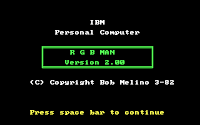

- They're all in BASIC
- In their title screens, they all rip off the layout of IBM's PC-DOS demonstration programs (DONKEY, etc.)
- From that design they retain the 'IBM' on top, but there's no IBM copyright notice
- There's no publisher info anywhere within the program, although some do list the author
- Some (not all) of them have a further "mystery code" on the title screen, with the format "XXX-5-5-Y"

My best guess would be that some BBS, users group, or disk club simply slapped a few standardized title screens on their user-submitted software. "IBM", at best, simply served to signify the platform, in the same way that software was referred to as being for "the Apple" or "the Commodore". Since those early shareware selections were incredibly promiscuous with their offerings, it's incredibly hard to figure out where these titles came from originally.
So, does anybody have a clue? And what could those cryptic XXX-5-5-Y "mystery codes" be?
↧
Olympiad: IBM prototype fonts unearthed
My Ultimate Oldschool PC Font Pack got some pretty cool responses, and one of them contained something quite unexpected: a set of files transferred from twenty-five 5.25" floppies, containing internal snapshots of font development done at IBM around 1984.
These prototype fonts were designed specifically for a project codenamed Olympiad. Familiar? Probably not, but it came to light a couple years later as the IBM 6150 AKA the RT PC, a RISC workstation and grandaddy of the PowerPC architecture. The type design work was evidently carried out in IBM's Austin, TX campus; the date stamps on the files range from Dec '83 to mid '85 - according to the contributor, this set of fonts took the team a year to deliver.
Inside the disks is a big bunch of bitmap character data, plus sample images and tools for internal use (some compiled, some written in IBM PC BASIC). The person who sent this to me had already extracted some of the bitmap data: it's mostly straight 1bpp framebuffer dumps, except for a few '.IDS' files that proved slightly tricky (with characters in sequence like a typical font ROM, except that the scanlines aren't byte-aligned, appallingly enough). Once I had everything converted, I promptly set about creating .FON and .TTF versions, as you do.
Clearly a lot of work went into these typefaces, and the result is stylized yet very legible. This kind of high-quality bitmap typography is not something that most people associate with mid-'80s IBM, as opposed to the early Macs for instance. Apparently, the team's research found that serifs make for better readability; whether true or not, these fonts are some of the better ones from the heyday of bitmap typefaces.
In all, there are six complete fonts with a selection of 571 characters each (mapped to unicode in the .TTF versions). Since every character from the good old DOS Codepage 437 makes an appearance, I've included DOS-mapped versions as well, because why not.
The fonts that ended up in the RT PC's AIX operating system are a good match for these - although that list contains a couple more fonts ('Ergonomic' and 12x30) not included here. The selection of characters is also largely the same, except for those last five math/technical symbols probably added later; the versions on these disks didn't have those, but we'll live without them.
Besides the MDA and EGA display options, the 615x family supported several RT-specific adapters for higher-resolution monochrome and color output. These did not have 'text modes' as such: "because the display adapters that drive the monitors are all-points-addressable, character boxes of any size may be used" - hence the fancy non-standard sizes. Despite this, the fonts are still monospaced (although the disks contain a few images that experimented with variable pitch). The 8x14 font is the only one that could conceivably work on EGA, and since it's designated 'E' on the disks, that was probably its purpose.
![]()
The disk archives themselves are intriguing to skim through - there's that neat time-capsule / behind-the-scenes factor, and you can follow the development process by browsing through the images in chronological order.
A few curious things that caught my eye:
In addition to the fonts, I have the contributor's permission to share the disk archives as well, so I'm posting them as received - complete with the .BMPs and conversion programs added on in the late '90s. Most files have date stamps though, so it's easy to tell what's what. For completeness sake, I've also included my own .PNG conversions of every image in the disk set.
These prototype fonts were designed specifically for a project codenamed Olympiad. Familiar? Probably not, but it came to light a couple years later as the IBM 6150 AKA the RT PC, a RISC workstation and grandaddy of the PowerPC architecture. The type design work was evidently carried out in IBM's Austin, TX campus; the date stamps on the files range from Dec '83 to mid '85 - according to the contributor, this set of fonts took the team a year to deliver.
 |
| Sample image off the work-in-progress files |
Inside the disks is a big bunch of bitmap character data, plus sample images and tools for internal use (some compiled, some written in IBM PC BASIC). The person who sent this to me had already extracted some of the bitmap data: it's mostly straight 1bpp framebuffer dumps, except for a few '.IDS' files that proved slightly tricky (with characters in sequence like a typical font ROM, except that the scanlines aren't byte-aligned, appallingly enough). Once I had everything converted, I promptly set about creating .FON and .TTF versions, as you do.
Clearly a lot of work went into these typefaces, and the result is stylized yet very legible. This kind of high-quality bitmap typography is not something that most people associate with mid-'80s IBM, as opposed to the early Macs for instance. Apparently, the team's research found that serifs make for better readability; whether true or not, these fonts are some of the better ones from the heyday of bitmap typefaces.
 |
| Olympiad Austin character set |
In all, there are six complete fonts with a selection of 571 characters each (mapped to unicode in the .TTF versions). Since every character from the good old DOS Codepage 437 makes an appearance, I've included DOS-mapped versions as well, because why not.
- Olympiad Austin (9x20 px), "intended as the primary font on release one" (it says here)
- Olympiad Austin Bold (9x20 px)
- Olympiad Austin Italic (9x20 px)
- Olympiad EGA (8x14 px)
- Olympiad Micro (4x8 px)
- Olympiad Title (18x40 px)
The fonts that ended up in the RT PC's AIX operating system are a good match for these - although that list contains a couple more fonts ('Ergonomic' and 12x30) not included here. The selection of characters is also largely the same, except for those last five math/technical symbols probably added later; the versions on these disks didn't have those, but we'll live without them.
Besides the MDA and EGA display options, the 615x family supported several RT-specific adapters for higher-resolution monochrome and color output. These did not have 'text modes' as such: "because the display adapters that drive the monitors are all-points-addressable, character boxes of any size may be used" - hence the fancy non-standard sizes. Despite this, the fonts are still monospaced (although the disks contain a few images that experimented with variable pitch). The 8x14 font is the only one that could conceivably work on EGA, and since it's designated 'E' on the disks, that was probably its purpose.

The disk archives themselves are intriguing to skim through - there's that neat time-capsule / behind-the-scenes factor, and you can follow the development process by browsing through the images in chronological order.
A few curious things that caught my eye:
- The presence of "HBASIC.EXE" tells us that the development process involved Hercules graphics cards - meaning that this group was internally using hardware that competed with IBM's own.
- There are other fonts besides the above six, but the character sets are partial, so they were probably abandoned along the way.
- Some of the familiar PC charsets make an appearance, like the MDA and BIOS ones (probably for comparison's sake, or for working off of).
- One of those other charsets is a 8x8 one that looks very similar (if not identical) to IBM's PC Convertible (5140) font. The Convertible hit the shelves not too long after the RT, and its built-in font was much like the Austin one with its serifs and stylized strokes, although the resolution was obviously lower. Since there's more than one revision of this 8x8 font here, it seems likely that the same team produced the Convertible font as an offshoot of the Olympiad typeface work.
 |
| IBM PC Convertible font prototype? |
Downloads
In addition to the fonts, I have the contributor's permission to share the disk archives as well, so I'm posting them as received - complete with the .BMPs and conversion programs added on in the late '90s. Most files have date stamps though, so it's easy to tell what's what. For completeness sake, I've also included my own .PNG conversions of every image in the disk set.
↧
Dopefish goes NTSC: Commander Keen 4 Composite CGA Patch Notes
If you're just landing here at random and wondering about the title: this is a 16-color 'remaster' of the original CGA version of Commander Keen IV: Secret of the Oracle, with code patched and graphics redrawn and reworked to take optimal advantage of CGA's composite output capabilities.
For more info (plus the download link), see the VOGONS thread - all sorts of cool stuff in there, like videos recorded from real hardware, and a DOSBox build patched with some useful additions for running this. However, I've had a request or two for the technical nitty-gritty, so here's where I'm gonna dump it (careful what you wish for? ;-))
![]()
![]()
![]()
This patch started out as direct modification of the .EXE, following some disassembly and analysis. I "ported" it to the CKPATCH format (for in-memory patching) only when I was done, by generating a binary diff. This is why my notes will follow the disassembly, which is easier to comment on; all offsets are relative to the beginning of the load image (=file offset minus 2C00h) in v1.4-Apogee of the CGA executable.
For new data, I found some 119 bytes that could be reused at offset 31548h. In KEEN4C.EXE this has the color tables for the EGA fade routines - they're still present in the CGA executable for no discernible reason. I ended up using only 36 bytes here, for extending the color tables used by various CGA drawing routines.
Finding space for new code was a bit trickier. I ended up settling on 11FDDh, which contained a seemingly-unused function (a pointer to it is set during initialization, but then quickly set to something else before it ever gets called... at least as far as I could determine). No idea what this code was supposed to do -- might be a leftover from the Keen Dreams code, since it looks similar to some routine used to cache KDR level data; if you know what's going on there, I'm all ears. Whatever it is, it gives us a very generous 367 bytes to stomp over, plenty more than the 96 I eventually needed.
First, let's change the 80x25 text screens from mode 3 to mode 2 - this disables NTSC color burst on the CGA, and the B&W picture results in more readable 80-column text on composite (of course, RGB monitors are not affected). There are two occurences of that:
Then there's graphics mode, which is set at 1AED9h. Keen uses mode 4 (320x200 @ 2bpp) with that infamous eyesore palette of cyan/magenta/white. We could still get 16 colors out of that on composite -- in fact that's what happens with the original game, although this is obviously not by design. I chose mode 6 however (640x200 @ 1bpp), mostly for cosmetic reasons: its palette of artifact colors is much more useful for Keen, plus it's more consistent between the 'old-style' and 'new-style' IBM CGA variants.
This requires an additional step, since in mode 6 the NTSC color burst has to be enabled manually with a register write, whereas mode 4 has it on by default. Otherwise we'd just get a B&W picture here too. This is where the new code space comes in handy:
KEEN4E messes with EGA palette registers for its fade-in/out effects, but the CGA version just drops the fade schtick altogether. I suppose they could've used the darker version of the cyan/magenta/white palette, but that gives you just one intermediate step between full brightness and a black screen. What's nice about composite mode 6 is that it lets us go one better -- and without those bloated color tables that the EGA version needs, either.
See, CGA lets us modify the foreground color in mode 6 (the default is F = intense white), unlike mode 4 where the same bits control the background color. In color composite mode this causes all 16 artifact colors to change accordingly (well, except black). For an EGA-like 4-step effect we can simply go "F, 7, 8, 0" to fade out, and the reverse to fade in.
Ah, but how can we splice this code into the CGA version? In yet another stroke of luck, the fade functions are still present in the CGA .EXE, and called from all the right places -- they're just do-nothing stubs. Even more luckily, these stubs don't just return immediately: thanks to Borland C calling conventions, they monkey around with BP and SP first. That brings them up to 5 bytes, just enough for a far jump to new code (not a far call, since that would push a return pointer onto the stack, and we have no room for an extra retf to deal with that).
The fade-out and fade-in stub routines are located at 1AF67h and 1AF6Ch respectively, so let's replace those with the jumps:
In turn, the new fade code writes the appropriate values to the color register, calls the game's existing wait-for-vblank routine (VW_WaitVBL) for timing, and sets some required variables before returning to the original caller (not the stub). Waiting for 6 VBLs between each step gets us a nice EGA-like, CPU-independent effect:
The important variable here is "screenfaded" (address 38CA1h), which is checked by the keystroke handling routine at 5CECh. The game shouldn't process keypresses while the screen is faded, or you may find yourself playing a level or navigating a menu on a completely black screen -- not terribly entertaining, I assure you. This proved to be a pain in the derriere until I had a look at what the EGA version was doing.
You'll notice that I also set "fontcolor" (326B7h) to 1 after fading out, which is a bit of a nasty kludge to fix some unseemly text discolorations. There's probably a slicker solution to that, but we'll get to the text stuff in a bit.
Besides sprites, tiles and pictures, the engine also draws single color elements onto the virtual screen segment (lines, rectangles and text), and does it often. In the CGA version, these functions all use 4-color lookup tables to do their business; to exploit our new-found 16-color composite palette, we're gonna need more than that.
These are the original tables - their roles are explained by the Keen Dreams sources (evidently that part of the code didn't change between KDR and CK4); the C functions use an array of bytes, and the ASM functions use an identical byte array and a word array:
A byte is 4 pixels in low-res CGA-land, so on screen we get (in base-4) 0000, 1111, 2222, 3333 - solid black, solid cyan, solid magenta, solid white. In composite color modes however, each nybble represents a color, at half the resolution (this is not entirely accurate, but it's a useful visualization device). That would translate to 00 (black), 55 (grey), AA (grey) and FF (white). The two greys, by the way, have the exact same luminance.
To get a bigger range of colors that don't look like crap, we add two new tables in the data patch space:
I only used 12 out of the new 16 colors there. There's enough room for the whole bunch, but I didn't need them all; and since I initially tried (and failed) to cram all the new *code* along with the data, space was at a premium. They're not in order either: the first 4 values duplicate the old tables, so whenever the color stays the same the index does too.
Of course, the functions that use these tables need to be told about the new locations:
This is where the boring part comes in: hunting down every piece of code that calls the above-mentioned graphics routines, figuring out what it does, and changing the color argument accordingly. Each value is an index to one of our new color tables. I'll only list the ones that I actually modified - about half of them were left untouched (mostly where black or white were appropriate):
Nope, we're not done yet... there's also this bunch of text displays, where the "fontcolor" variable gets the same treatment:
I thought it'd be a nice touch if the in-game status panel (the big one you bring up with the Enter key) looked more like its EGA counterpart, which meant changing some field backgrounds from black to white. Problem was, the code sets AX to 0 (black) with "xor ax,ax" which is a two-byte instruction. White (3) -- or any other value -- would require "mov ax,color" which is a three-byter.
Fortunately, the next argument pushed is always a byte value (and AH remains zero), so we can shave off a byte by using "mov al" instead of "mov ax", and rewrite these bits thusly:
I still had a minor but annoying issue: the font color never gets reset during the demo loop, and once the high scores come up, it just blissfully XORs the text using whatever color the previous change had set. This didn't just make the colors wrong; on composite, certain color transitions create hideous edge artifacts that make text completely unreadable. To wit:
![]()
To get this one sorted, I had to find more patch space by moving things around (previously I was shoving my new code into the data space as well). This allowed me to inject some code where I needed to explicitly set the font color. As a bonus, I could now do the same with the status panel and message boxes -- as-is they both use the same color for text, but since the backgrounds colors are different, the color value for XOR has to differ as well.
As I recall, there were *still* occasional issues with the high score colors after I did that. I forget exactly what the major malfunction was, but at this point I decided to just bring a gun to the knife fight -- set fontcolor to 1 on every fade-out, so whatever text gets printed next will have that color, unless another routine explicitly sets it to something else. Dirty, but whatever works.
For those long text passages, the Keen Galaxy games use their own resource format with rudimentary markup features -- among them are hexadecimal color codes (^C[0-F]). These are mapped to our familiar color array (the word-sized one) using yet another lookup table, this time at 2CE26h. We have 16 entries here, although the CK4 texts only ever use three of them (B, E and F). The CGA version maps all three to the same color, but that's trivial enough to rectify:
The routine that displays all this XORs the font color with the background before drawing it, but this isn't strictly necessary; you can bake that into the values chosen above, and I ended up doing that and NOP-ing this instruction out... probably because that let me trim an entry or two off my color tables, or something. Kind of heavy-handed, but there you have it.
And at long last, thus ends our wrangling with the .EXE.
Well, there are a few other modifications like the initialization text and filename changes, but not much to say about those. Enough hacking for a couple weeks (and, I suspect, enough reading for a year).
...
Wait, there's still one small trivial matter left...
...as you might expect, this is what took most of the effort. I won't launch into a technical tutorial about drawing for this mode, but there are a number of reasons why you can't just remap the palette of the EGA graphics and call it a day.
I could probably go on, but what this means is that practically all the graphics had to be reworked and redrawn. Most early games that supported composite color on CGA featured coarse, blocky, low-res graphics precisely for these reasons. One of my goals here was to avoid that, and preserve as much detail as I could; I hope I've succeeded, at least somewhat.
Importing those reworked graphics into the game may be a little easier to explain. As mentioned in the readme, I used ModId for the job, which handles "regular" 4-color CGA graphics just fine; the reworked assets can be easily converted into a format that ModId can deal with. Let's have a look at one:
![]()
![]()
On the left is what you see on composite; on the right is the RGBI pixel data under the hood - black and white patterns at 640x200. I typically work in Photoshop using RGB mode, with a palette that matches the 16 target colors, and a series of fill layers that go on top of the image and selectively blend each pattern over its matching color. This is similar to a trick mentioned in a previous post, with the bonus that I can always save a B&W RGBI picture like the one on the right, and feed it to reenigne's cga2ntsc for quick proofing.
ModId needs 320x200 4-color images, though, which isn't what we're working with. Luckily, as far as the CGA is concerned, the memory layout is the same - except that each nybble represents two four-color dots instead of four two-color dots. We simply have to replace each pattern with the corresponding 4-color one; once the game displays it *in mode 6*, we get just the result we need.
![]()
For instance, nybble pattern #9 (1001 in binary = white-black-black-white in mode 6) equals 21 in base 4, that is, magenta-cyan in mode 4. By replacing the aforementioned group of fill layers to generate these patterns instead, we get a fake mode-4 image that can be saved as an indexed .BMP and imported with ModId.
That's it. Still here? Go convert your own Keen mod. ;-)
For more info (plus the download link), see the VOGONS thread - all sorts of cool stuff in there, like videos recorded from real hardware, and a DOSBox build patched with some useful additions for running this. However, I've had a request or two for the technical nitty-gritty, so here's where I'm gonna dump it (careful what you wish for? ;-))
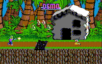
This patch started out as direct modification of the .EXE, following some disassembly and analysis. I "ported" it to the CKPATCH format (for in-memory patching) only when I was done, by generating a binary diff. This is why my notes will follow the disassembly, which is easier to comment on; all offsets are relative to the beginning of the load image (=file offset minus 2C00h) in v1.4-Apogee of the CGA executable.
Patch space
For new data, I found some 119 bytes that could be reused at offset 31548h. In KEEN4C.EXE this has the color tables for the EGA fade routines - they're still present in the CGA executable for no discernible reason. I ended up using only 36 bytes here, for extending the color tables used by various CGA drawing routines.
Finding space for new code was a bit trickier. I ended up settling on 11FDDh, which contained a seemingly-unused function (a pointer to it is set during initialization, but then quickly set to something else before it ever gets called... at least as far as I could determine). No idea what this code was supposed to do -- might be a leftover from the Keen Dreams code, since it looks similar to some routine used to cache KDR level data; if you know what's going on there, I'm all ears. Whatever it is, it gives us a very generous 367 bytes to stomp over, plenty more than the 96 I eventually needed.
Mode setting
First, let's change the 80x25 text screens from mode 3 to mode 2 - this disables NTSC color burst on the CGA, and the B&W picture results in more readable 80-column text on composite (of course, RGB monitors are not affected). There are two occurences of that:
1789AB002         moval,2; was: 3
1789CB400         movah,0
1789ECD10         int10h; SET VIDEO MODE
1789E; AL = mode

1AED2B80200       movax,2; was: 3
1AED5CD10         int10h; SET VIDEO MODE
1AED5; AL = mode
Then there's graphics mode, which is set at 1AED9h. Keen uses mode 4 (320x200 @ 2bpp) with that infamous eyesore palette of cyan/magenta/white. We could still get 16 colors out of that on composite -- in fact that's what happens with the original game, although this is obviously not by design. I chose mode 6 however (640x200 @ 1bpp), mostly for cosmetic reasons: its palette of artifact colors is much more useful for Keen, plus it's more consistent between the 'old-style' and 'new-style' IBM CGA variants.
 |
| Composite CGA artifact color palette (mode 6, foreground F) |
This requires an additional step, since in mode 6 the NTSC color burst has to be enabled manually with a register write, whereas mode 4 has it on by default. Otherwise we'd just get a B&W picture here too. This is where the new code space comes in handy:
1AED99A8D13C510   callnewColorMode6; 10C5:138D - needs relocation!
1AED9; was: mov ax,4 ; int 10

newColorMode6:
11FDDB80600       movax,6
11FE0CD10         int10h; SET VIDEO MODE
11FE0; AL = mode
11FE2BAD803       movdx,3D8h; CGA mode control register
11FE5B01A         moval,1Ah; burst on
11FE7FA           cli
11FE8EE           outdx,al
11FE9FB           sti
11FEACB           retf
New fade routines for CGA
KEEN4E messes with EGA palette registers for its fade-in/out effects, but the CGA version just drops the fade schtick altogether. I suppose they could've used the darker version of the cyan/magenta/white palette, but that gives you just one intermediate step between full brightness and a black screen. What's nice about composite mode 6 is that it lets us go one better -- and without those bloated color tables that the EGA version needs, either.
See, CGA lets us modify the foreground color in mode 6 (the default is F = intense white), unlike mode 4 where the same bits control the background color. In color composite mode this causes all 16 artifact colors to change accordingly (well, except black). For an EGA-like 4-step effect we can simply go "F, 7, 8, 0" to fade out, and the reverse to fade in.
Ah, but how can we splice this code into the CGA version? In yet another stroke of luck, the fade functions are still present in the CGA .EXE, and called from all the right places -- they're just do-nothing stubs. Even more luckily, these stubs don't just return immediately: thanks to Borland C calling conventions, they monkey around with BP and SP first. That brings them up to 5 bytes, just enough for a far jump to new code (not a far call, since that would push a return pointer onto the stack, and we have no room for an extra retf to deal with that).
The fade-out and fade-in stub routines are located at 1AF67h and 1AF6Ch respectively, so let's replace those with the jumps:
; old_VW_FadeOut:
1AF67EAB113C510jmpnewFadeOut; 10C5:13B1 - needs relocation!
; old_VW_FadeIn:
1AF6CEA9B13C510jmpnewFadeIn; 10C5:139B - needs relocation!
In turn, the new fade code writes the appropriate values to the color register, calls the game's existing wait-for-vblank routine (VW_WaitVBL) for timing, and sets some required variables before returning to the original caller (not the stub). Waiting for 6 VBLs between each step gets us a nice EGA-like, CPU-independent effect:
newFadeIn:
11FEBB80800       movax,8; 8 = dark grey
11FEEE82C00       calloutAndWait; near $+2Ch
11FF140           incax; 7 = light grey
11FF2E82800       calloutAndWait; near $+28h
11FF5B00F         moval,0Fh; F = white
11FF7E82300       calloutAndWait; near $+23h
11FFAC70681C40000 mov   screenfaded,0
12000CB           retf
newFadeOut:
12001B80700       movax,7; 7 = light grey
12004E81600       calloutAndWait; near $+16h
12007B008         moval,8; 8 = dark grey
12009E81100       calloutAndWait; near $+11h
1200C33C0         xorax,ax; 0 = black
1200EE80C00       calloutAndWait; near $+0Ch
12011C70681C40100 mov   screenfaded,1
12017C606975E01   mov   fontcolor,1
1201CCB           retf
outAndWait:
1201DBAD903       movdx,3D9h; CGA color control register
12020FA           cli
12021EE           outdx,al
12022FB           sti
12023B006         moval,6; wait 6 VBLs
1202550           pushax
120269A290BC51B   callVW_WaitVBL; 1BC5:0B29 - needs relocation!
1202B58           popax
1202CC3           retn
The important variable here is "screenfaded" (address 38CA1h), which is checked by the keystroke handling routine at 5CECh. The game shouldn't process keypresses while the screen is faded, or you may find yourself playing a level or navigating a menu on a completely black screen -- not terribly entertaining, I assure you. This proved to be a pain in the derriere until I had a look at what the EGA version was doing.
You'll notice that I also set "fontcolor" (326B7h) to 1 after fading out, which is a bit of a nasty kludge to fix some unseemly text discolorations. There's probably a slicker solution to that, but we'll get to the text stuff in a bit.
Expanded color lookup tables
Besides sprites, tiles and pictures, the engine also draws single color elements onto the virtual screen segment (lines, rectangles and text), and does it often. In the CGA version, these functions all use 4-color lookup tables to do their business; to exploit our new-found 16-color composite palette, we're gonna need more than that.
These are the original tables - their roles are explained by the Keen Dreams sources (evidently that part of the code didn't change between KDR and CK4); the C functions use an array of bytes, and the ASM functions use an identical byte array and a word array:
; old_c_colorbyte
315CB0055AAFF     db0,55,0AAh,0FFh

; old_asm_colorbyte
326740055AAFF     db0,55,0AAh,0FFh
; old_asm_colorword
3267800005555[...]dw0,5555h,0AAAAh,0FFFFh
A byte is 4 pixels in low-res CGA-land, so on screen we get (in base-4) 0000, 1111, 2222, 3333 - solid black, solid cyan, solid magenta, solid white. In composite color modes however, each nybble represents a color, at half the resolution (this is not entirely accurate, but it's a useful visualization device). That would translate to 00 (black), 55 (grey), AA (grey) and FF (white). The two greys, by the way, have the exact same luminance.
To get a bigger range of colors that don't look like crap, we add two new tables in the data patch space:
newNTSCcolorByte
315480055AAFF[...]db0,55h,0AAh,0FFh,44h,22h,0CCh,77h,0BBh,99h,66h,0DDh
newNTSCcolorWord
3155400005555[...]dw0,5555h,0AAAAh,0FFFFh,4444h,2222h,0CCCCh,7777h,
0BBBBh,9999h,6666h,0DDDDh
I only used 12 out of the new 16 colors there. There's enough room for the whole bunch, but I didn't need them all; and since I initially tried (and failed) to cram all the new *code* along with the data, space was at a premium. They're not in order either: the first 4 values duplicate the old tables, so whenever the color stays the same the index does too.
Of course, the functions that use these tables need to be told about the new locations:
; VW_Hlin (draw horizontal line) +0Eh:
1B22C8A87284D     moval, newNTSCcolorByte[bx]
; VW_Plot (plot pixel) +2Bh - may be unused, but whatever:
1BC838A8F284D     movcl, newNTSCcolorByte[bx]
; VW_Vlin (draw vertical line) +2Bh:
1BCC28A9F284D     movbl, newNTSCcolorByte[bx]
; VWL_XORBuffer (xor buffer to virtual screen) +09h:
1C3B48B87344D     movax, newNTSCcolorWord[bx]
Recoloring various elements
This is where the boring part comes in: hunting down every piece of code that calls the above-mentioned graphics routines, figuring out what it does, and changing the color argument accordingly. Each value is an index to one of our new color tables. I'll only list the ones that I actually modified - about half of them were left untouched (mostly where black or white were appropriate):
04B89BF0500       movdi,5; death prompt hilite 1
04B8EBF0600       movdi,6; death prompt hilite 2
0610FB80700       movax,7; in-game status panel BG
188BEB80800       movax,8; menu - bottom border
18911B80800       movax,8; menu - top border
18A71B80800       movax,8; menu popup - top border
18A8CB80800       movax,8; menu popup - bottom border
18AAAB80800       movax,8; menu popup - left border
18AC5B80800       movax,8; menu popup - right border
18C9FB80800       movax,8; menu popup - separator
1930CB008         moval,8; key config - focus on
19310B009         moval,9; key config - focus off
19A36B008         moval,8; save/load - focus on
19A3AB009         moval,9; save/load - focus off
1A4A8B80800       movax,8; paddlewar - top edge
1A4C0B80800       movax,8; paddlewar - bottom edge
Nope, we're not done yet... there's also this bunch of text displays, where the "fontcolor" variable gets the same treatment:
03F17C606975E01   mov   fontcolor,1; high scores - active input only
07A84C606975E01   mov   fontcolor,1; text screens - page counter
18800C606975E08   mov   fontcolor,8; menu option - focus on
18807C606975E09   mov   fontcolor,9; menu option - focus off
1883AC606975E09   mov   fontcolor,9; menu legend
18C65C606975E08   mov   fontcolor,8; menu popup text
18CC1C606975E09   mov   fontcolor,9; menu popup legend
190BEC606975E09   mov   fontcolor,9; controls menu - config option
19103C606975E08   mov   fontcolor,8; key config - current (border)
19431C606975E08   mov   fontcolor,8; joystick calibration - legend
1995CC606975E08   mov   fontcolor,8; gravis gamepad text
19D6BC606975E08   mov   fontcolor,8; save game - active input
19F6CC606975E08   mov   fontcolor,8; paddlewar - scores
1AB3CC606975E01   mov   fontcolor,1; default message color
1AB7CC606975E08   mov   fontcolor,8; 'quitting' message box
I thought it'd be a nice touch if the in-game status panel (the big one you bring up with the Enter key) looked more like its EGA counterpart, which meant changing some field backgrounds from black to white. Problem was, the code sets AX to 0 (black) with "xor ax,ax" which is a two-byte instruction. White (3) -- or any other value -- would require "mov ax,color" which is a three-byter.
Fortunately, the next argument pushed is always a byte value (and AH remains zero), so we can shave off a byte by using "mov al" instead of "mov ax", and rewrite these bits thusly:
; status panel - 'Location' background
06149B80300       movax,3; 3b ;   was: xor  ax, ax   (2b)
0614C50           pushax; 1b ;        push ax       (1b)
0614DB014         moval,14h; 2b ;        mov  ax, 14h  (3b)

; status panel - 'Level' background
062E4B80300       movax,3; 3b ;   was: xor  ax, ax   (2b)
062E750           pushax; 1b ;        push ax       (1b)
062E8B00A         moval,0Ah; 2b ;        mov  ax, 0Ah  (3b)

; status panel - inventory background
0649DB80300       movax,3; 3b ;   was: xor  ax, ax   (2b)
064A050           pushax; 1b ;        push ax       (1b)
064A1B00A         moval,0Ah; 2b ;        mov  ax, 0Ah  (3b)
I still had a minor but annoying issue: the font color never gets reset during the demo loop, and once the high scores come up, it just blissfully XORs the text using whatever color the previous change had set. This didn't just make the colors wrong; on composite, certain color transitions create hideous edge artifacts that make text completely unreadable. To wit:

To get this one sorted, I had to find more patch space by moving things around (previously I was shoving my new code into the data space as well). This allowed me to inject some code where I needed to explicitly set the font color. As a bonus, I could now do the same with the status panel and message boxes -- as-is they both use the same color for text, but since the backgrounds colors are different, the color value for XOR has to differ as well.
; playDemoStuff +14h
03D6A9AF413C510   callsetDemoFontFG; 5b ;  was: mov  ax, si    (2b)
;       add  ax, 128Ah (3b)
; 10C5:13F4 - needs relocation!
setDemoFontFG:
12044C606975E01   mov   fontcolor,1
120498BC6         movax,si
1204B058A12       addax,128Ah
1204ECB           retf
; drawStatusPanel +9Bh
060D39AE913C510   callsetPanelFG; 5b ;  was: mov  ax, di    (2b)
;       add  ax, 8     (3b)
; 10C5:13E9 - needs relocation!
setPanelFG:
12039C606975E07   mov   fontcolor,7
1203E8BC7         movax,di
12040050800       addax,8
12043CB           retf
; drawMsgBoxBG +24h
180189ADD13C510   callsetMsgBoxFG; 5b ;  was: mov ax,[36D1C] (3b)
1801D90           nop; 1b ;       mov [36CDF],ax (3b)
; 10C5:13E9 - needs relocation!
setMsgBoxFG:
1202DC606975E03   mov   fontcolor,3
12032A1FCA4       movax,[36D1C]
12035A3BFA4       mov[36CDF],ax
12038CB           retf
As I recall, there were *still* occasional issues with the high score colors after I did that. I forget exactly what the major malfunction was, but at this point I decided to just bring a gun to the knife fight -- set fontcolor to 1 on every fade-out, so whatever text gets printed next will have that color, unless another routine explicitly sets it to something else. Dirty, but whatever works.
Story/help text screens
For those long text passages, the Keen Galaxy games use their own resource format with rudimentary markup features -- among them are hexadecimal color codes (^C[0-F]). These are mapped to our familiar color array (the word-sized one) using yet another lookup table, this time at 2CE26h. We have 16 entries here, although the CK4 texts only ever use three of them (B, E and F). The CGA version maps all three to the same color, but that's trivial enough to rectify:
2CE3C0B00         dw0Bh; txtColorCodeLUT[11]
2CE420300         dw3; txtColorCodeLUT[14]
2CE440A00         dw0Ah; txtColorCodeLUT[15]
The routine that displays all this XORs the font color with the background before drawing it, but this isn't strictly necessary; you can bake that into the values chosen above, and I ended up doing that and NOP-ing this instruction out... probably because that let me trim an entry or two off my color tables, or something. Kind of heavy-handed, but there you have it.
0762790           nop; helpTxtSub +D3h
0762890           nop; was:  xor fontcolor,3  (5b)
0762990           nop
0762A90           nop
0762B90           nop
And at long last, thus ends our wrangling with the .EXE.
Well, there are a few other modifications like the initialization text and filename changes, but not much to say about those. Enough hacking for a couple weeks (and, I suspect, enough reading for a year).
...
Wait, there's still one small trivial matter left...
Reworking the graphics
...as you might expect, this is what took most of the effort. I won't launch into a technical tutorial about drawing for this mode, but there are a number of reasons why you can't just remap the palette of the EGA graphics and call it a day.
- For a start, you don't even have a constant horizontal resolution. Given that artifact colors are generated by manipulating pixel patterns, your effective resolution depends on the specific colors you're transitioning between at any particular point.
- The color of a pixel depends on its horizontal position (modulus 160, which is the number of NTSC color cycles per active CGA scanline).
- As shown, some colors will artifact badly when placed next to each other, depending (again) on the horizontal offset of the transition... in other words, you can't just have whatever color you want wherever you want, a luxury most pixel artists probably take for granted. (Oh, you'd like a light blue pixel right next to this brown one, wouldn't you? No problem sir; enjoy your bright radioactive green. *Trollface goes here*)
- The palette itself has a rather different relationship between the colors, compared to those RGBI colors on EGA. It's lacking in nice pure reds, but gives you three perfectly good green hues; you get two identical-looking 50% greys, instead of that convenient 0-8-7-15 ramp; and so on so forth.
- The 'checkerboard' dithering style (which Keen uses extensively) would transform into solid horizontal lines of alternating colors... unless you make it twice as coarse.
I could probably go on, but what this means is that practically all the graphics had to be reworked and redrawn. Most early games that supported composite color on CGA featured coarse, blocky, low-res graphics precisely for these reasons. One of my goals here was to avoid that, and preserve as much detail as I could; I hope I've succeeded, at least somewhat.
Importing those reworked graphics into the game may be a little easier to explain. As mentioned in the readme, I used ModId for the job, which handles "regular" 4-color CGA graphics just fine; the reworked assets can be easily converted into a format that ModId can deal with. Let's have a look at one:


On the left is what you see on composite; on the right is the RGBI pixel data under the hood - black and white patterns at 640x200. I typically work in Photoshop using RGB mode, with a palette that matches the 16 target colors, and a series of fill layers that go on top of the image and selectively blend each pattern over its matching color. This is similar to a trick mentioned in a previous post, with the bonus that I can always save a B&W RGBI picture like the one on the right, and feed it to reenigne's cga2ntsc for quick proofing.
ModId needs 320x200 4-color images, though, which isn't what we're working with. Luckily, as far as the CGA is concerned, the memory layout is the same - except that each nybble represents two four-color dots instead of four two-color dots. We simply have to replace each pattern with the corresponding 4-color one; once the game displays it *in mode 6*, we get just the result we need.

For instance, nybble pattern #9 (1001 in binary = white-black-black-white in mode 6) equals 21 in base 4, that is, magenta-cyan in mode 4. By replacing the aforementioned group of fill layers to generate these patterns instead, we get a fake mode-4 image that can be saved as an indexed .BMP and imported with ModId.
That's it. Still here? Go convert your own Keen mod. ;-)
↧
Yet another 16-color CGA makeover: Keen 5
After giving Keen 4's CGA version a 16-color composite overhaul, I figured I'd have a go at the next episode, since the code has nearly everything in common with Keen 4, and the composite enhancements detailed in my previous post could be applied without too many essential changes (other than different offsets/addresses, of course). Let's strap this one to the rack then:
![]()
![]()
![]()
As before, the distribution is a runtime in-memory patch (using CK5PATCH) and you'll need the original KEEN5 CGA files (v1.4 Apogee release). If you're hardcore enough to go the real hardware route, you'll also need DOS 3.3+, a true blue IBM CGA card (early/'old'-style is best), and a composite monitor/TV.
Naturally, the graphics data for the game had to be completely reworked here too. Compared to episode 4 this was interestingly different: Keen 4 has a mostly organic-looking, earthy style to its environments, with plenty of curved or irregular shapes and large details; Keen 5 goes for the 'tech' look, with straighter lines and lots of small elaborate mechanistic decor. Given the limitations of composite video, both were artistically challenging to rework, though in rather different ways.
The only real 'new' piece of code this time is the palette animation for the game over screen; the EGA version messes with the galaxy colors before the particle explosion (which, BTW, is a slideshow on a real XT!), but the vanilla CGA version settles for a boring static image. The CGA code didn't helpfully hold my hand this time either, since I had no stubs / calls to blank leftover functions to work with, like I had with the fades.
In the end I rolled my own routine, which only kinda-sorta mimics its EGA counterpart visually (EGA can alter individual color registers, while composite CGA in mode 6 may only modify the foreground color, which in turn changes the entire set of 16 artifact colors). On the other hand, I guess it's pretty neat that these color changes can still be tailored to make *parts* of a particular image disappear/reappear, instead of having a uniform fade.
![]()


As before, the distribution is a runtime in-memory patch (using CK5PATCH) and you'll need the original KEEN5 CGA files (v1.4 Apogee release). If you're hardcore enough to go the real hardware route, you'll also need DOS 3.3+, a true blue IBM CGA card (early/'old'-style is best), and a composite monitor/TV.
Naturally, the graphics data for the game had to be completely reworked here too. Compared to episode 4 this was interestingly different: Keen 4 has a mostly organic-looking, earthy style to its environments, with plenty of curved or irregular shapes and large details; Keen 5 goes for the 'tech' look, with straighter lines and lots of small elaborate mechanistic decor. Given the limitations of composite video, both were artistically challenging to rework, though in rather different ways.
The only real 'new' piece of code this time is the palette animation for the game over screen; the EGA version messes with the galaxy colors before the particle explosion (which, BTW, is a slideshow on a real XT!), but the vanilla CGA version settles for a boring static image. The CGA code didn't helpfully hold my hand this time either, since I had no stubs / calls to blank leftover functions to work with, like I had with the fades.
In the end I rolled my own routine, which only kinda-sorta mimics its EGA counterpart visually (EGA can alter individual color registers, while composite CGA in mode 6 may only modify the foreground color, which in turn changes the entire set of 16 artifact colors). On the other hand, I guess it's pretty neat that these color changes can still be tailored to make *parts* of a particular image disappear/reappear, instead of having a uniform fade.

↧
↧
Keen 4 Mystery Code Demystified
In my post on Keen 4 I mentioned a seemingly-unused routine in v1.4-CGA, which I ended up using as patch space for my own code. Having no idea what it was for, I consulted the sources for Keen Dreams, and found that it looked an awful lot like a KDR routine which caches level data - specifically, CA_CacheMarks in ID_CA.C. At some point during Keen 4's initialization, a single pointer gets set to this code; but immediately afterwards the address is replaced so this function is never executed.
NY00123 took a closer look at it, and it turns out that that's exactly what it is: leftover level-loading code from Keen Dreams. It's still fully-functional, too: for whatever reason, id left it lying around as a placeholder in later versions of their engine, and simply reset the pointer at runtime to whatever new thing they came up with.
Amusingly, you can bring it back into action by NOPing out the pointer overwrites - this replaces Keen's finger-counting with a KDR-style progress bar (or a "thermometer" in contemporary id palance):
![]()
![]()
In the EGA version, this is done by changing 36 bytes to 90h, starting at offset 66FFh in the .EXE (=38FFh in the load image). Same for the CGA version, except that the file offset is 6492h (=3892h in the load image).
Or, if you prefer using CK4PATCH, here's a .PAT file courtesy of NY00123. This is for the EGA version; for CGA just change the offset as above.
At this point, you may interject with the suggestion that this is one of the most utterly pointless things you've ever heard of. In that case - to quote one of George R. R. Martin's ridiculously overused stock phrases - "you're not wrong" (dude's gotta have a macro for that in his often-mentioned copy of WordStar for DOS).
NY00123 took a closer look at it, and it turns out that that's exactly what it is: leftover level-loading code from Keen Dreams. It's still fully-functional, too: for whatever reason, id left it lying around as a placeholder in later versions of their engine, and simply reset the pointer at runtime to whatever new thing they came up with.
Amusingly, you can bring it back into action by NOPing out the pointer overwrites - this replaces Keen's finger-counting with a KDR-style progress bar (or a "thermometer" in contemporary id palance):


In the EGA version, this is done by changing 36 bytes to 90h, starting at offset 66FFh in the .EXE (=38FFh in the load image). Same for the CGA version, except that the file offset is 6492h (=3892h in the load image).
Or, if you prefer using CK4PATCH, here's a .PAT file courtesy of NY00123. This is for the EGA version; for CGA just change the offset as above.
# Patch file for Keen - use with CK4PATCH.EXE
%ext ck4
%version 1.4
# Use alternative cache-box from ID_CA.C
%patch $38FF $90 $90 $90 $90 $90 $90 $90 $90 $90 $90 $90 $90 $90 $90 $90 $90 $90 $90
             $90 $90 $90 $90 $90 $90 $90 $90 $90 $90 $90 $90 $90 $90 $90 $90 $90 $90
%end
At this point, you may interject with the suggestion that this is one of the most utterly pointless things you've ever heard of. In that case - to quote one of George R. R. Martin's ridiculously overused stock phrases - "you're not wrong" (dude's gotta have a macro for that in his often-mentioned copy of WordStar for DOS).
↧
Happy 35th birthday, IBM PC!
August 12, 1981 introduced us to the IBM PC, and to PC-DOS along with it. The latter included extensions for the machine's ROM BASIC, plus a slew of demonstration programs proudly showing off these indispensable capabilities: 4-color graphics and 1-bit beeper sound. One of them in particular went on to live in certain infamy as Bill Gates' first (and only) direct personal contribution to video game history: the inimitable DONKEY.
So I'm a few days late to the party, but hopefully my little present can still be accepted: Sorry Ass, a tiny remake of DONKEY.BAS designed to fit into a standard floppy disk's 512-byte boot sector. The only requirements are 8088+, CGA+, a keyboard and a disk drive, so this should run on most x86-based PCs all the way back to the original IBM 5150. For an appropriately eardrum-raping approximation of the jackass greeting your bumper, the PC speaker is also supported.
Assembly source is included, plus a 442-byte .COM version for use under DOS. The 360KB disk image is bootable and can be written directly to a floppy, or started from DOSBox ("boot SorryAss.ima"), PCEm, and so on; if you're so inclined you can pad it with zero bytes to your favorite standard disk size.
- Download (7 KB .zip)
- Pouet prod page
↧
Steel Survivor: An IBM XT Tale

I received this from Trixter, truly a gentleman and a scholar, along with a separate box of stuff to round it out: an IBM PC/XT keyboard, a joystick, some software/games (including a boxed IBM PC-DOS 3.30), and the Guide to Operations. The machine itself is very well-equipped too, complete with an XT-CF adapter, an IBM CGA board, and a Sound Blaster Pro 2.0, but more about that in a bit.

This thing went through a bit of a misadventure en-route to me. USPS turned out to have some inexplicable restrictions on package sizes to my country - except for Global Priority Express shipments... and I don't need to tell you how much that would've cost. The only available box that satisfied these arbitrary limits didn't leave much room for extra protective padding on the sides. After some consideration, we decided to brave it anyway: those early IBMs are built like brick shithouses and could stand being knocked around a bit, right? So, off it went on its merry way with as much compressed foam as could be stuffed around the sides and corners.
My first clue that something was wrong came when I picked up the package from the post office, and heard the ominous yet unmistakable sounds of something rattling inside… uh oh. Opening it up, it was immediately evident that we had underestimated our respective postal services' capacity for malicious damage.


In case these photos do not convey the full magnitude of the crime: something, somehow, has managed to apply such a massive amount of force to this box that the corners of the cover were savagely bent inwards at the back, on both sides. Remember, we're talking heavy-gauge sheet metal. This initially prevented me from even removing the cover at all, until I employed a screwdriver and a hammer rather forcefully (the thought still makes me wince a little).
The cover yielded, and it transpired that the rattling I'd heard was only the PC speaker, which had been knocked out of its holder; that was the least of my problems. The back panel (also metal) evidently got a vicious whack on its right side, just where the card brackets go. This shoved everything forward, also slamming the full-length CGA board against the front of the case and dislodging the little plastic brace that keeps it in place there. The hard drive bay cover wasn't spared either; one of the lobes where it's screwed to the chassis was broken off.

None of the important components appeared to be busted or injured, but this naturally left me a bit dispirited, fearing damage to the cards, the slots and/or the motherboard... let alone the bits I couldn't inspect at a glance, like the mechanical innards of the floppy drive. However, testing was gonna have to wait, since I was going away for a couple of weeks and didn't yet have a 220V→110V step-down transformer (the PSU is American).
Imagine my considerable delight when I came back, got the power converter, plugged everything in, and gingery flipped the Big Red Switch… then the RAM test crawled its way up the count, to finally greet me with this heart-warming display:

Rock 'n' roll! Yep, it Just Worked. Actually, everything just worked; the CF card was helpfully packed with diagnostic programs, music/graphics stuff and so on, so I soon established that there were no casualties except the aesthetics: from the sound card to the floppy drive, all systems are go.
See, those early IBMs were sturdy steel beasts and for that I am thankful. I'm not sure how they managed to inflict such next level punishment on the package, but they must've tried real hard to brutalize it like that. If this was any kind of plastic-cased computer (or monitor), I'd be fishing jigsaw puzzle pieces out of that box. But even with a few nicks in its armor, the IBM XT is a die-hard heavy metal road warrior.
Now that things were looking good, I took out the cards, applied more physical persuasion where needed, and soon the case and cover were looking much better:

So, what's inside?
- IBM CGA (later revision, with the 'new-style' composite output)
- IBM Diskette Drive Adapter (later revision, Intel P8272A FDC chip)
- XT-CF-Lite v4.1 board (prototype based on Sergey Malinov's redesign)
- Sound Blaster Pro 2.0 (CT1600)
- Serial/Parallel board
- RTC board (with a button-cell CR2032 battery)
- Half-height 5.25" DSDD floppy drive
- 20MB Seagate ST-225 hard drive (this came with the system, but it's unplugged as I'm using the CF card; I do have the controller for it though)


My modern LCD TV plays nice enough with CGA signals over composite, but that's not terribly convenient (nor 'authentic') so I looked around for something else. By a lucky coincidence, a TV repair shop literally down the street from me had a nice CRT TV for cheap - a 1999 Brother set with a TINT control, which confirmed NTSC compatibility (something you can't take for granted in this PAL country). The 14" size makes it a neat substitute for a monitor.

Being composite, of course it isn't ideally suited for 80-column text mode in color. It can be made to work, but there's a reason why it's always been considered pretty much unreadable:

The keyboard is in excellent shape. People talk a lot of smack about the original PC/XT layout, and it's far from ideal, but I'm not finding it that difficult to adapt. After all, the first keyboard I ever typed on was like that. And the capacitive buckling spring keys are like a party under your fingers! [Read as an overexcited Rajesh from Big Bang Theory]


The CF card has single DOS 6.22 partition. True, 6.22 is a memory hog on when you can't throw HMA or UMBs at it; and the first DIR after a reboot can take some 20 seconds to calculate the free space… but the 2GB of space are worth it, and so is the speed:

For games, there's the Total DOS Launcher which Trixter has been working on. Not really final yet, but it works great; this is a game organizer/launcher which doesn't need any per-game configuration, lets you store your games in ZIPs, index them by running a script (on a modern system) and just copy them over and play. Runs on just about anything, from an 8088 (even a PCjr) and up. With a newer system you can use fancy VESA text modes too; but since I'm displaying CGA on a TV, I either run it in 40 columns (if I want color) or 80 columns in B&W.

Running some more cool stuff just for the heck of it:


Going through these old games again on the original hardware, it's sometimes remarkable to find what sticks with you even after decades. When I was about 9 I used to play the shit out of Cosmic Crusader, and I got real good at it. You know how when you kick ass at a game, you develop an almost instinctual muscle-memory for playing it? After all these years it's apparently still there, and I can get "in the zone" with very little effort. Funny how that works.
TAKE THAT, MICHAEL ABRASH! *points to the lives column on the right*

So, what do I still want?
- An early-revision CGA card, so I'd have something else to test fine-tuned composite artifact tricks on (see 8088 MPH).
- Perhaps a network card, for easier file transfers.
- And of course: an IBM 5153 monitor. I really don't know how I'd get one shipped, though... there's no way it could survive the extreme abuse that the XT did, and I've seen enough horror stories of such monitors arriving in way more than one piece.
↧